Preview image. Unlock full-res
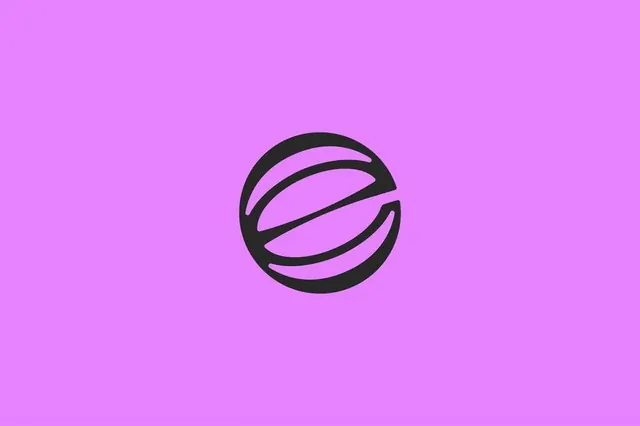
A black circular logomark built from an outer ring and two swooping interior strokes that read as a stylized globe or letter, centered on a flat lavender field.
Summary
A single black logomark, an outer circle cut by two curved interior strokes that suggest both a globe with a meridian and a stylized "e" or "S", sitting dead center on a saturated lavender background.
Visual description
The mark is solid black on a flat, slightly graduated lavender-to-magenta field with no other elements. It is a near-perfect circle whose interior is carved by two sweeping curved strokes that arc in opposite directions and break the ring, leaving thin slivers of background that act as negative-space dividers. The result reads simultaneously as a wireframe globe with a tilted axis line and as a letterform. All strokes hold a consistent heavy weight, and the composition is fully symmetrical and centered, presented at app-icon scale.
Key takeaway
Carving a single letterform out of a globe by breaking the ring with two opposing curves, so one mark says both "letter" and "world" at once. Using thin gaps of the background color as the only dividers keeps the icon to one solid shape, which holds up at favicon and app-icon sizes.
Reuse notes
A solid reference for a monogram or globe mark for a brand with a global, network, or connectivity story. The heavy single-weight stroke survives heavy scaling, and the loud flat backdrop is a presentation choice you would swap per context. Test the negative-space slivers at small sizes, since they are the first detail to collapse.