Preview image. Unlock full-res
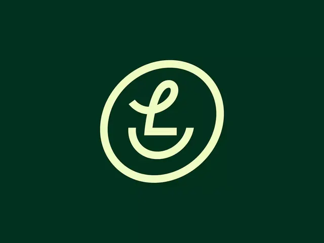
A monoline lowercase L logo built as a face, with a looping ascender eye and a curved baseline smile, set inside a hand-drawn circle on deep forest green.
Summary
A monoline lowercase L lettermark that doubles as a smiling face, formed by a looping ascender for the eye and a curved baseline that reads as a smile, all held inside a thin hand-drawn circle.
Visual description
Pale lime cream linework sits centered on a flat deep forest green field. The mark is a single consistent stroke weight throughout. An open loop at the top forms the L's ascender and reads as an eye or a leaf, the vertical of the L drops to a short flat foot, and a wide upturned arc beneath becomes a smiling mouth. A roughly circular outline, slightly irregular and not perfectly geometric, frames the glyph like a coin or a badge. There is no wordmark, tagline, or supporting text, just the icon floating in generous green space.
Key takeaway
The double-read: one continuous monoline does triple duty as a letter, a face, and a leaf. The deliberately imperfect hand-drawn circle warms up an otherwise geometric mark and keeps it from feeling corporate.
Reuse notes
Good for a friendly consumer or wellness brand that wants approachable rather than clinical. The single-weight stroke scales down to a favicon cleanly. Pair with the same lime-on-green duotone elsewhere in the system so the mark feels native rather than placed.