Preview image. Unlock full-res
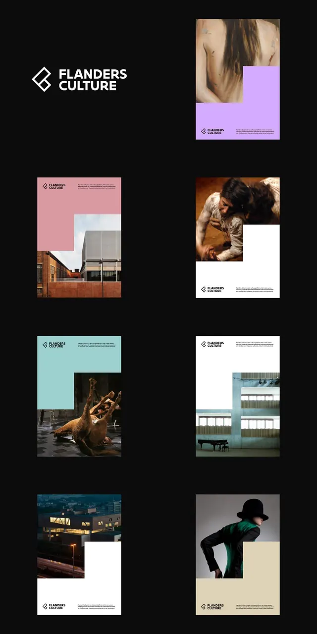
A poster series for Flanders Culture on black, each pairing a pastel color block with an L-shaped cultural photograph and a diamond logo lockup.
Summary
A branding presentation board for "Flanders Culture" laid out as seven posters on a black background, all built from one rule: a flat color block and a photograph interlock into an L-shape, captioned by a small angular logo and copy. The white diamond-and-name logo sits alone top-left as the system key.
Visual description
The board is near-black. Top-left is the wordmark: an outlined diamond mark beside "FLANDERS / CULTURE" in white all-caps sans. The remaining grid holds six poster variants, each a square split into a solid color zone (lavender, dusty pink, mint, cream, white) and a moody photograph of architecture, dance, or a costumed figure, the two shapes notched together so neither is a plain rectangle. Each poster carries the small mark plus a paragraph of body copy in its corner. Photography is desaturated and atmospheric; the color blocks supply the only saturation.
Key takeaway
One interlocking color-block-plus-photo template, recolored per poster, makes a whole campaign feel unified while every piece stays distinct. Presenting the variants tiled on black reads instantly as a system rather than one-offs. The L-shaped notch is what keeps it from looking like a default split layout.
Reuse notes
Ideal for cultural programs, festivals, or museums that need many event posters from a single recipe. The black presentation field is for the case study; individual posters likely live on white or color. Depends on a strong, consistently treated photo library to hold together.
More like this






Keep what you find
A free account saves references to boards and can send you a weekly email of picks based on what you save.
To see every result, go Pro.