Preview image. Unlock full-res
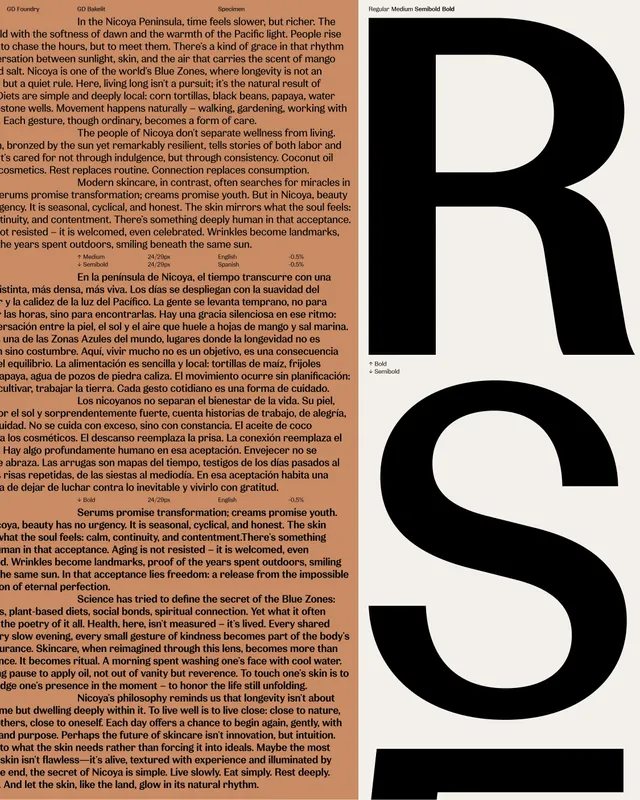
A literary brand identity system for Nicoya, showcasing dense, multi-lingual body text and philosophical language alongside a monolithic black mark, evoking slow living and natural intimacy.
Summary
A literary lifestyle brand identity for Nicoya, layering dense philosophical text in multiple languages with a bold monolithic black letterform to evoke slow living, natural intimacy, and untamed beauty.
Visual description
The layout assembles pages from a brand identity system. Upper left shows dense multi-paragraph body copy in mixed languages (Spanish and English) set in small, tight serif, creating a continuous text block. Callout text emphasizes evocative phrases like "Inclusive. Empathetic. Transformative." A half-page of cream stock displays a bold, abstract black geometric mark (a stylized curved form suggesting landscape or growth). Footer panels include dense copy blocks and a colorful hero image with warm earth tones (rust, ochre, sage green), featuring organic forms and natural textures. The palette throughout is muted: cream, charcoal black, warm terracotta, and soft sage-green accents.
Key takeaway
Dense, poetic body copy paired with minimal graphic elements creates intellectual depth without visual clutter. A single monolithic mark (not illustrative, not decorative) anchors the brand with presence and mystery. The mixed-language approach signals global or introspective audience without diluting a core voice.
Reuse notes
Fits literary journals, slow-living or wellness brands, and nonprofit or educational organizations. Works well for brands emphasizing philosophy, narrative depth, or natural/organic positioning. High text density reads as premium and editorial; pair with plenty of white space in application. The warm earth palette is inherent to the brand's identity.
More like this



Keep what you find
A free account saves references to boards and can send you a weekly email of picks based on what you save.
To see every result, go Pro.