Preview image. Unlock full-res
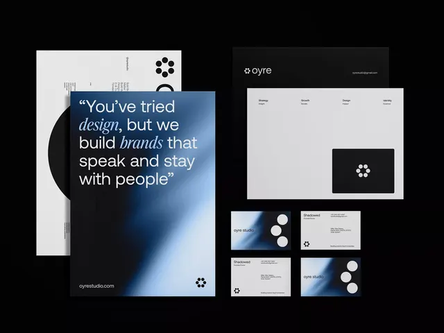
A sophisticated brand identity for a creative studio featuring a geometric dot-cluster mark, high-contrast black and white palettes, and ethereal blue gradient accents.
Summary
A minimalist creative studio brand identity featuring a geometric dot-cluster icon, austere black and white color scheme, and subtle blue gradient accents across business cards and collateral.
Visual description
A cohesive brand identity for Oyre Studio displayed across multiple formats: a vertical brand poster with a quote "You've tried design, but we build brands that speak and stay with people," business cards, and envelope designs. The visual system uses stark contrast between deep black and crisp white, with a distinctive mark comprising five white circles arranged organically. A soft blue-to-white gradient appears as a background element on the poster, providing visual warmth and movement. Typography is clean sans-serif with occasional italic emphasis on key words. The layout is asymmetrical and modern, with generous whitespace and card-based composition showing how the system scales across applications.
Key takeaway
The simple geometric icon (five dots) is highly memorable and scales across contexts from icon to pattern. High-contrast black/white palettes read as premium and contemporary; the soft blue gradient acts as a sophisticated visual accent without overwhelming the minimalism. The quote on the poster demonstrates how brand messaging can integrate with identity systems to communicate studio philosophy.
Reuse notes
Ideal for design, creative, or marketing-focused agencies needing to convey professionalism and innovation. The system's minimalism and geometric language work across digital and print, from business cards to presentations. Best suited for brands targeting sophisticated, design-conscious audiences.
More like this






Keep what you find
A free account saves references to boards and can send you a weekly email of picks based on what you save.
To see every result, go Pro.