Preview image. Unlock full-res
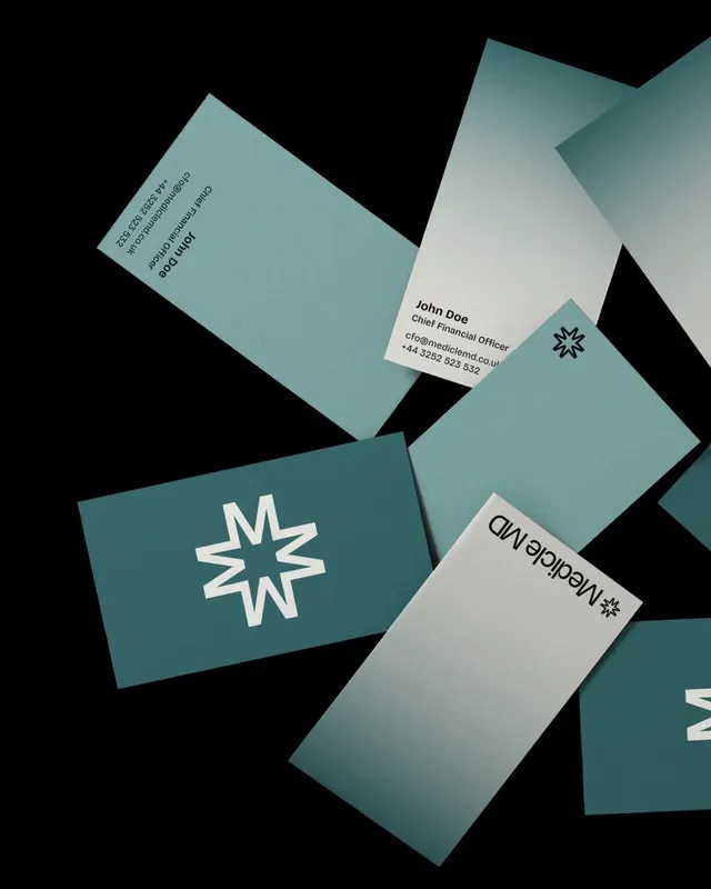
Corporate identity for a financial services firm combining a geometric starburst logo with teal, cream, and black business cards arranged on a dark background.
Summary
Financial services identity system using a white geometric starburst mark, printed on teal and cream business cards arranged diagonally across a black studio background.
Visual description
Four business cards and one letterhead spread against pure black, rotated at varying angles. Two teal cards and two cream cards. The teal cards display a stark white starburst (eight-pointed geometric star) as the primary visual element, simple and bold. Cream cards carry contact information in clean sans-serif: 'John Doe', 'Chief Financial Officer', email, phone number. The two color blocks work together as a system, alternating to create visual rhythm. Typography is minimal, left-aligned on the cream cards. The starburst appears as both a logo (front teal card) and a secondary mark (upper right, cream card).
Key takeaway
The two-color system using tonal contrast (warm teal against cool cream) for variety within constraint; the geometric starburst as a punctuation mark rather than ornament; the spatial composition showing multiple collateral pieces together; the clarity of role separation between cards (teal for mark, cream for information).
Reuse notes
Ideal for financial, consulting, tech, or professional services where trust and clarity matter. The teal-cream-black palette reads as contemporary corporate without coldness. Works well for B2B collateral or situations requiring printed identity across multiple formats. The simplicity requires excellent printing and paper quality to feel premium.
More like this







Keep what you find
A free account saves references to boards and can send you a weekly email of picks based on what you save.
To see every result, go Pro.