Preview image. Unlock full-res
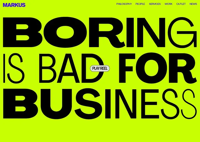
A full-bleed agency hero with BORING IS BAD FOR BUSINESS in huge black type on acid-green, a violet MARKUS wordmark, nav, and an inline PLAY REEL pill.
Summary
An agency landing-page hero where the slogan BORING IS BAD FOR BUSINESS fills the screen in massive black sans-serif on an acid lime-green field, with a violet MARKUS logo and slim nav up top and a tiny PLAY REEL pill nested inside the type.
Visual description
The four-line headline is set in heavy grotesque caps scaled so big the letters run edge to edge and overlap line to line, leaving almost no green showing between rows. The only color besides black-on-lime is the violet MARKUS wordmark at top left, which is echoed in the violet nav links (PHILOSOPHY, PEOPLE, SERVICES, WORK, OUTLET, NEWS) ranged top right in small caps. A small rounded grey-white PLAY REEL button is tucked between BAD and FOR on the middle line, a deliberate clash of tiny UI affordance against giant display type. The composition is flat, dense, and confrontational, with negative space squeezed out entirely.
Key takeaway
Letting one opinionated sentence become the entire layout, scaled until it overflows the frame, is a high-conviction agency move. Nesting a small functional CTA inside the oversized headline merges the message and the action in one gesture. The violet accent on acid green is a deliberately abrasive, memorable pairing.
Reuse notes
Reach for this when a creative studio or brand wants a loud, statement-first homepage that signals confidence over polish. Needs genuinely strong copy, the headline is the whole design. The neon-green-and-violet combination is intense, so reserve it for brands that want to provoke rather than reassure.
More like this


Keep what you find
A free account saves references to boards and can send you a weekly email of picks based on what you save.
To see every result, go Pro.