Preview image. Unlock full-res
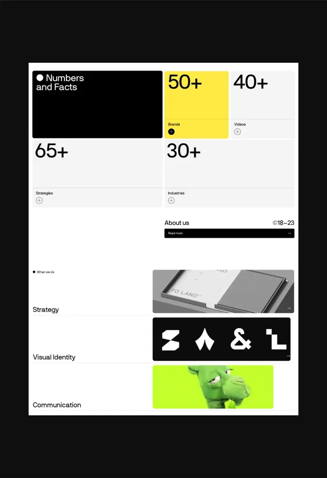
A stark black-and-white brand identity system with bright lime-yellow accent, featuring numeric stats, four geometric symbol marks, and modular grid composition.
Summary
A brutalist brand system combining stark black-and-white hierarchy with a lime-yellow stat highlight, modular symbol icons, and bold typography.
Visual description
A single-page brand guide or portfolio piece on a light gray background. Top section displays a "Numbers and Facts" black block with two yellow highlighted stat cards (50+, 40+) and two light-background stat cards (65+, 30+) labeled Brands, Videos, Strategies, and Industries. Below is an About section with a black Read More button and copy. Lower sections feature a product photo labeled Strategy, four minimal geometric symbols in white on black (angular marks suggesting Z, arrow, ampersand, L forms) labeled Visual Identity, and a bright lime-green cropped image labeled Communication. All typography is bold, sans-serif, left-aligned except for stat numbers which are display-weight. The grid is modular and asymmetric, balancing dense blocks with white space.
Key takeaway
The lime-yellow accent against pure black creates dramatic contrast and visual anchoring without feeling overwrought. The four geometric marks are simple, memorable, and scalable. The modular card layout allows content flexibility (stats, images, text blocks) while the rigid grid and bold typography maintain cohesion and authority.
Reuse notes
Perfect for design agencies, creative studios, or tech companies wanting to project boldness and clarity. The neon accent works especially well in digital and print contexts. Works on light or dark backgrounds; consider swapping colors for dark theme. The grid is dense but legible; reduce information density if adapting for smaller screens. Avoids trendy styles, so the system stays contemporary for several years.
More like this



Keep what you find
A free account saves references to boards and can send you a weekly email of picks based on what you save.
To see every result, go Pro.