Preview image. Unlock full-res
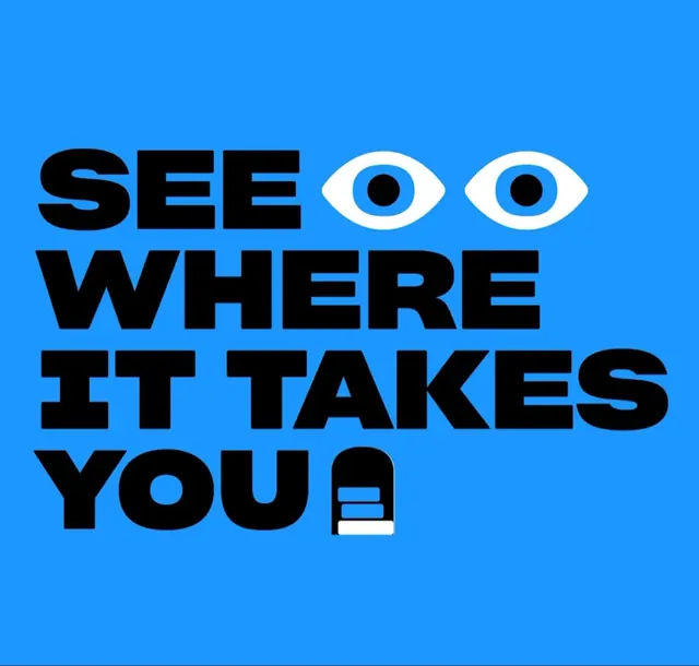
Bold black slab-sans wordmark reading SEE WHERE IT TAKES YOU on a bright blue field, with two illustrated eyes and a tiny phone icon swapped in for letters.
Summary
A four-line all-caps headline, SEE WHERE IT TAKES YOU, set in a heavy black slab-sans on a saturated blue ground, with illustrated icons standing in for letters. The defining move is letterform substitution: two cartoon eyes replace the O-pair after SEE and a small phone shape closes out YOU.
Visual description
The composition is a tight left-aligned typographic stack filling the frame on a single flat blue background (no gradient, no texture). The type is an extra-bold geometric sans with near-square proportions and minimal spacing between lines, so the four words read as one solid block. After the word SEE, two white almond-shaped eyes with solid black pupils sit on the baseline in place of letters. The final line, YOU, ends with a small rounded white-and-black glyph resembling a phone or device. All marks are pure black and white against the blue, with no other accent color.
Key takeaway
Swapping repeated round letters (the O or double-O) for a pair of illustrated eyes turns a flat headline into a face that looks back at the viewer. Keeping the icons strictly two-color (black and white) lets them sit inside the type without breaking the lockup's weight or rhythm.
Reuse notes
Good for a campaign headline, event title, or hero where one playful idea needs to carry the whole frame. Works because the icon is literal to the word ("SEE" plus eyes). Reach for it when you have a short, action-led tagline and want personality without illustration overhead. Needs a heavy display sans and a single loud background to hold up.
More like this
Keep what you find
A free account saves references to boards and can send you a weekly email of picks based on what you save.
To see every result, go Pro.