Preview image. Unlock full-res
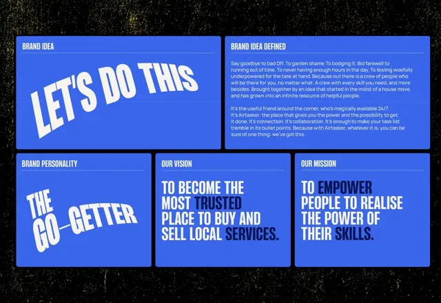
A blue-on-black brand strategy layout where labeled cards spell out brand idea, personality, vision and mission in warped, oversized condensed display type.
Summary
A brand strategy board that lays out brand idea, personality, vision and mission as a grid of royal-blue rounded cards on a near-black background, with key phrases set in warped, oversized condensed display type.
Visual description
Five rounded-corner cards sit on a textured black field in a loose two-row grid. Small all-caps blue labels ("BRAND IDEA", "BRAND PERSONALITY", "OUR VISION", "OUR MISSION", "BRAND IDEA DEFINED") sit at the top of each card above a thin rule. The headline phrases ("LET'S DO THIS", "THE GO-GETTER", and the vision and mission statements) are set in a heavy condensed sans that is skewed and italicized so the letters lean and warp dramatically. Within the long statements, select words are knocked back to a lighter blue while the rest stays white, creating a two-tone emphasis. One card carries a full paragraph of running body copy at small size as the counterweight to the oversized display blocks.
Key takeaway
The warped, leaning condensed display type gives a flat strategy deck kinetic energy without any imagery. The trick of recoloring individual words inside an all-caps statement (white plus a muted blue) builds a reading rhythm and signals the words that matter. Pairing tiny blue labels over a hairline rule keeps every card legibly structured even as the type goes loud.
Reuse notes
Good for a brand strategy or positioning section, a pitch deck values slide, or an about page that needs to feel energetic rather than corporate. The skew effect only reads as intentional on short, punchy phrases; keep body copy upright. Works best on a dark ground where one saturated accent color carries the whole palette.
More like this


Keep what you find
A free account saves references to boards and can send you a weekly email of picks based on what you save.
To see every result, go Pro.