Preview image. Unlock full-res
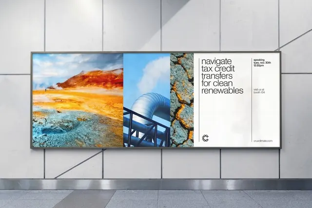
A transit billboard for Crux Climate pairing three vertical geothermal nature photos with a white text panel reading navigate tax credit transfers for clean renewables in lowercase sans.
Summary
A framed transit billboard for Crux Climate that splits into four vertical bays: three full-bleed geothermal nature photographs and a fourth white panel carrying the headline and details.
Visual description
The billboard sits in a grey-tiled station concourse, lit from above. Inside its thin metal frame, the layout is a strict four-column grid. Columns one through three are vertical photographs of geothermal terrain, an orange-and-teal sulphur field with a tiny walking figure, a silver industrial pipe against blue sky, and cracked rust-colored ground. The fourth column is solid white and holds lowercase grey sans-serif type: the headline navigate tax credit transfers for clean renewables at top, a small speaking-date block and visit us at booth 104 to its right, an abstract snowflake-like mark at lower left, and cruxclimate.com at the bottom. The photo trio supplies all the color; the text bay supplies all the quiet.
Key takeaway
Treating photography as equal-width vertical columns turns three unrelated images into one rhythmic band. Reserving a single full-height white column for all the words keeps a busy, colorful piece legible and corporate at the same time. The lowercase sans plus tiny logo at the foot reads modern fintech, not heavy industry.
Reuse notes
A reusable system for a climate, energy, or B2B-finance brand that needs to feel both earthy and institutional. The column grid scales from billboard to web hero to deck cover. Caveat: it lives or dies on photo selection, the images must share a tonal family or the band falls apart. Pair with a restrained one-weight type system.
More like this





Keep what you find
A free account saves references to boards and can send you a weekly email of picks based on what you save.
To see every result, go Pro.