Preview image. Unlock full-res
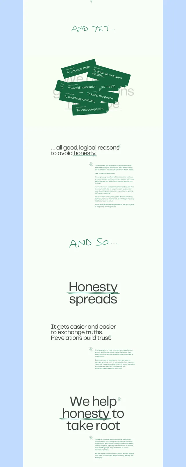
A tall editorial spread system with deep green accents, centered stack layout, and generous white space emphasizing movement and sustainability messaging.
Summary
A tall, vertically stacked editorial system in cream and deep green that leads with a values statement and unfolds through organic, hand-drawn shapes and modular text blocks.
Visual description
A pale blue border frames a tall, cream-colored composition. At the top sits a headline: "We want to be honest" in a clean sans-serif. Below, the word "About" introduces a section with organic, woven green ribbon-like shapes and surrounding body text. Mid-page, "And so" transitions to a larger section labeled "Honesty spreads" with more paragraph text, followed by "We help honesty to take root" and a deep green footer bar with white text and a small badge. The layout prioritizes white space around each text block, creating a meditative rhythm.
Key takeaway
The use of organic, flowing shapes to interrupt minimalist typography without breaking the calm. The vertical stacking and breathing space between sections builds narrative momentum. The deep green is used strategically as both accent and anchor, not as background noise. The overall effect reads as trustworthy and intentional.
Reuse notes
Excellent for mission-driven or values-heavy brands, especially nonprofits, sustainability platforms, or service companies. The system scales well from mobile-first to print. The organic shapes and white space work particularly well when the reader expects to spend time with content. Avoid cramping the breathing room.
More like this




Keep what you find
A free account saves references to boards and can send you a weekly email of picks based on what you save.
To see every result, go Pro.