
Preview image. Unlock full-res
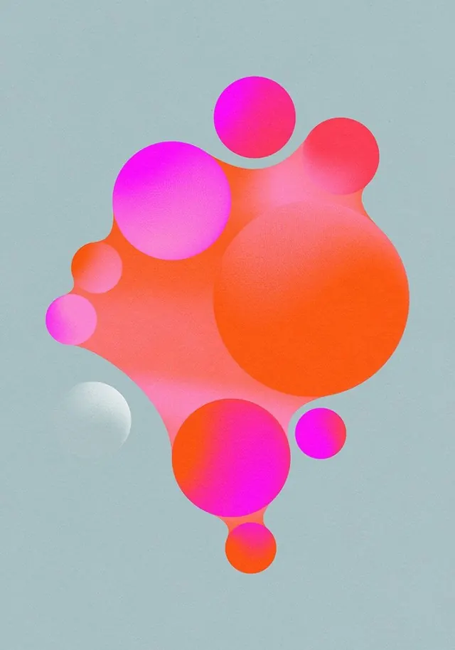
A vibrant brand identity for Soundtrap featuring bold organic shapes in gradient colors with a playful geometric wordmark.
Summary
A vibrant brand identity for Soundtrap featuring abstract organic shapes in warm gradient colors paired with a clean sans-serif wordmark and symbol.
Visual description
Two large soft, rounded organic shapes (resembling musical note or wave forms) in pink-to-orange gradient fill most of the composition against a deep magenta background. The shapes overlap slightly, creating visual rhythm. A clean geometric mark (curved parentheses or waveform symbol) appears to the left of the word "Soundtrap" in white sans-serif type. The overall effect is modern, playful, and accessible.
Key takeaway
Friendly abstraction through organic geometry and gradient: the soft shapes and warm colors communicate creativity and approachability, while the clean type grounds the identity in professionalism.
Reuse notes
Excellent reference for music, audio, or creative tool branding. The gradient technique and organic shapes work well for consumer-facing applications. The color palette conveys energy and innovation. Highly adaptable to many creative industry contexts. The symbol/wordmark combination is scalable and memorable.
More like this

Keep what you find
A free account saves references to boards and can send you a weekly email of picks based on what you save.
To see every result, go Pro.