Preview image. Unlock full-res
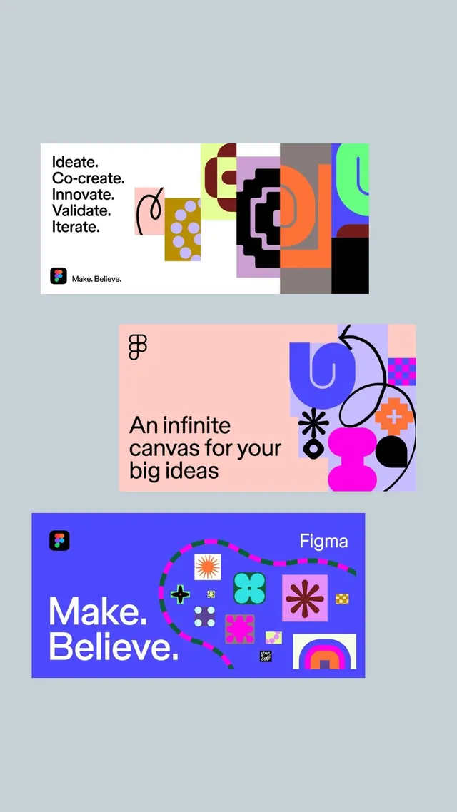
Playful design system mixing structured process-visualization panels with vibrant geometric and organic shapes, branded around the \"Make. Believe.\" tagline.
Summary
A playful brand-system expression for a design-focused company featuring a modular library of geometric and organic shapes, process diagrams, and icons arranged across three thematic panels.
Visual description
The top white-to-gray panel shows a left-aligned vertical word list (Ideate, Co-create, Innovate, Validate, Iterate) paired with a scattered arrangement of colorful squares, rectangles, and circular elements in mustard, maroon, pink, bright blue, lime, and orange, plus a small rounded-square logo mark reading "Make. Believe." A curved line traces through the shapes organically. The middle panel has a soft pink background with centered typography ("An infinite canvas for your big ideas") anchored by abstract line-drawn symbols and glowing curved shapes in indigo and magenta, plus a scattered few geometric blocks in lavender, pink, and muted tones. The bottom panel is a vibrant bright-blue background with large white sans-serif type ("Make. Believe.") and a scattered library of 15+ small shapes: circles, stars, crosses, plus-signs, hollow and filled elements, dashes, small branded marks, a rainbow gradient arc, and organic squiggles, all in hot pink, cyan, lime, white, and dark accents.
Key takeaway
A modular, playful shape vocabulary that feels both structured (grid-friendly) and organic (scattered, informal arrangement). The split between muted earthy tones (for process/seriousness) and vivid neon accents (for energy/playfulness) shows constraint within exuberance. Thematic consistency across panels via the repeated brand mark and a coherent but varied icon/shape language.
Reuse notes
Ideal for design tools, creative software, or agencies wanting to convey both rigor and playfulness. Works best when shapes are treated as a reusable kit rather than one-off graphics. The pastel-plus-neon color split manages to feel both sophisticated and approachable, good for audience trust without losing personality. Effective as internal brand documentation or external marketing materials.
More like this

Keep what you find
A free account saves references to boards and can send you a weekly email of picks based on what you save.
To see every result, go Pro.