Preview image. Unlock full-res
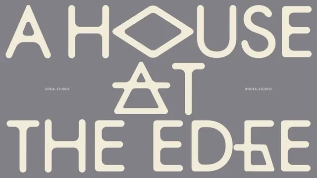
A typographic brand treatment spells out \"A HOUSE AT THE EDGE\" in oversized cream lettering on a muted gray background.
Summary
A typographic brand treatment spells out "A HOUSE AT THE EDGE" in oversized cream lettering on a muted gray background.
Visual description
The image shows large cream letters arranged across three lines to read "A HOUSE AT THE EDGE," with the "O" replaced by a diamond-shaped outline and the "A" on the middle line drawn as a stylized triangular mark. Small studio credit text appears near the center left and center right on a flat gray background.
Key takeaway
Use one custom letterform or symbol to turn a plain wordmark into a memorable identity device. Keep the palette extremely restrained so the typography carries the entire composition.
Reuse notes
This approach works for identity studies, title graphics, or brand posters where a phrase needs to feel iconic without additional imagery. It is strongest when the layout can stay centered and spacious, with no competing elements.
More like this







Keep what you find
A free account saves references to boards and can send you a weekly email of picks based on what you save.
To see every result, go Pro.