Preview image. Unlock full-res
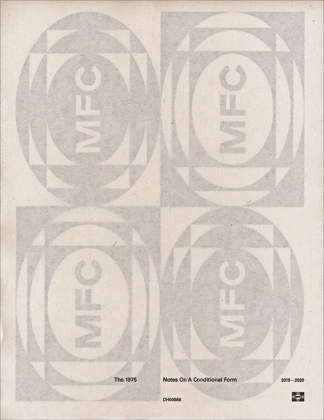
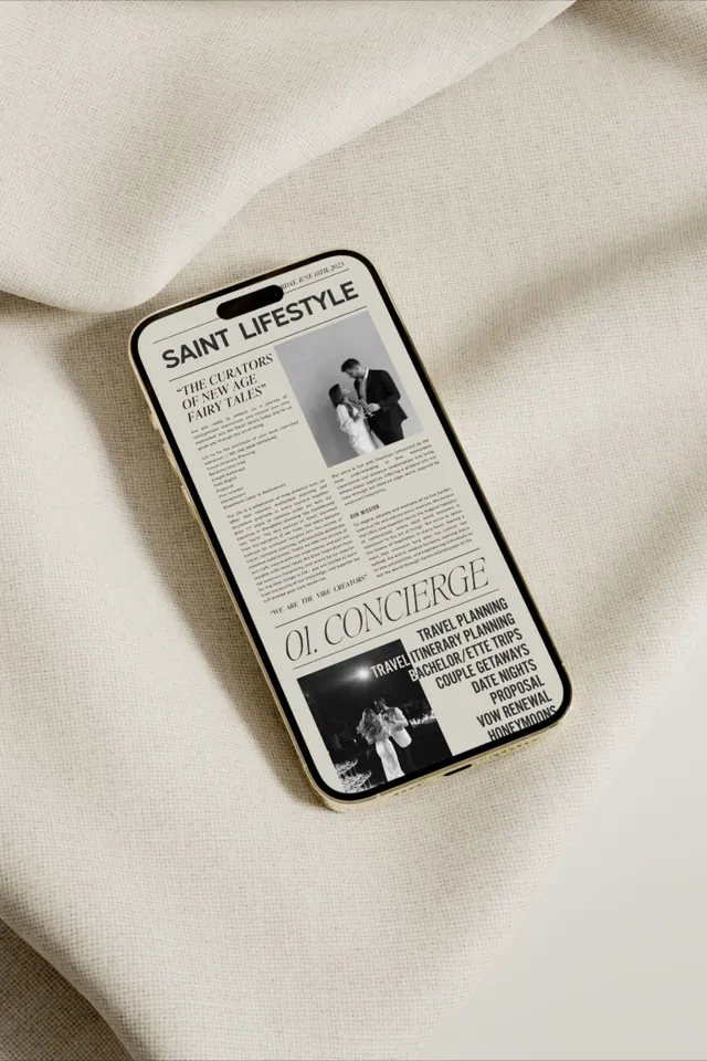
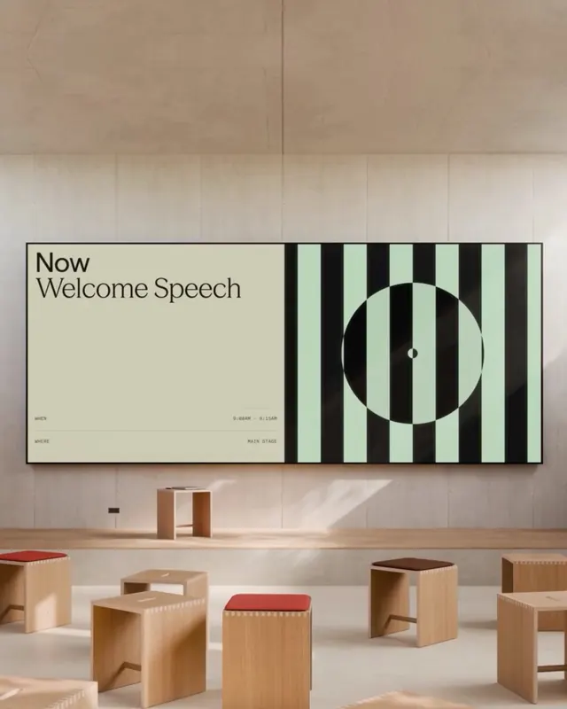
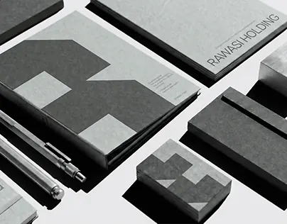
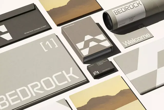
A stationery mockup presents a cohesive branded identity system on a pale background with gray, black, and beige printed pieces arranged in an asymmetrical grid.
Summary
A stationery mockup presents a cohesive branded identity system on a pale background with gray, black, and beige printed pieces arranged in an asymmetrical grid.
Visual description
The image shows a spread of branded stationery items including a box, a rolled poster, booklets, cards, and flat sheets arranged diagonally across a light surface. The pieces use muted neutrals with large sans-serif lettering, geometric marks, and a few photographic landscape panels.
Key takeaway
Use a restrained neutral palette with oversized typography and geometric shapes to make the identity feel deliberate and premium. Present the system as a carefully composed flat-lay so the components read as one cohesive family.
Reuse notes
This approach works well for identity presentations, packaging systems, and branding case-study imagery where material consistency matters. It is especially effective when you want the design to feel sophisticated without relying on bright color or decorative effects.