Preview image. Unlock full-res
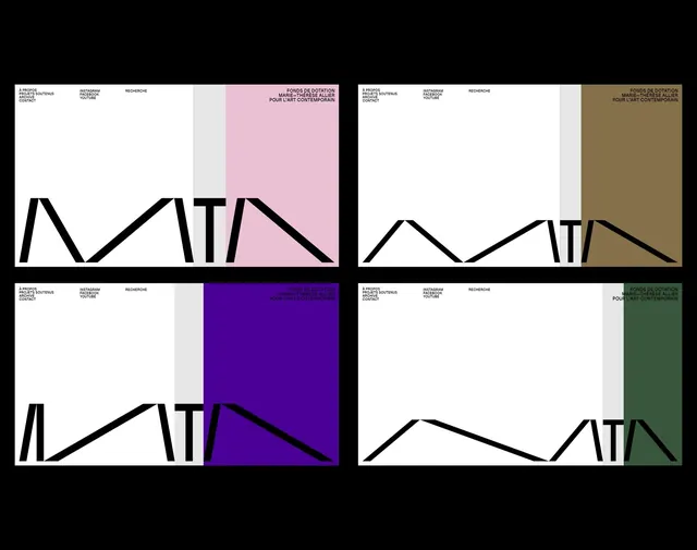
A four-up identity presentation showing the same minimalist website layout adapted with different accent color blocks and a large angular black wordmark shape.
Summary
A four-up identity presentation showing the same minimalist website layout adapted with different accent color blocks and a large angular black wordmark shape.
Visual description
The image is arranged as a 2x2 grid of nearly identical website mockups on a black background. Each mockup has a white main field, tiny all-caps navigation text at the top, a narrow pale gray vertical strip, a large colored block on the right, and a thick black angular wordmark or line form anchored along the bottom edge.
Key takeaway
Use a restrained Swiss-style grid and let one saturated accent block carry the variation across multiple brand states. Pair tiny upper-corner navigation with oversized cropped geometry to make the system feel editorial and contemporary.
Reuse notes
This works well for identity systems, cultural institutions, and design-forward nonprofit branding where the layout itself is part of the presentation. It is strongest when you want a minimal page frame that can flex across multiple accent colors without changing the core structure.
More like this








Keep what you find
A free account saves references to boards and can send you a weekly email of picks based on what you save.
To see every result, go Pro.