Preview image. Unlock full-res
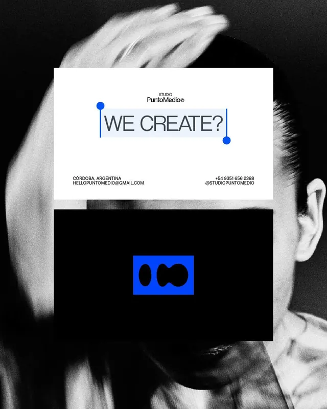
A black-and-white studio promo layout with a centered white card, a blue selection-style headline treatment, and a smaller logo block below.
Summary
A black-and-white studio promo layout with a centered white card, a blue selection-style headline treatment, and a smaller logo block below.
Visual description
A grainy black-and-white portrait fills the background while two large rectangular panels sit centered on top of it. The upper white panel contains a small studio wordmark, a large gray headline reading “WE CREATE?”, and blue vertical selection-like lines with circular handles framing the type; the lower black panel contains a small blue rectangle with a black abstract mark inside.
Key takeaway
Use a stark black-and-white photo base with a single electric-blue accent to make the typography feel like a highlighted UI selection. The stacked white-on-black panel composition creates a strong identity-system poster without needing much content.
Reuse notes
This works well for studio identity, agency promo, or portfolio announcement graphics where you want a fashion/editorial feel. It is strongest when the message is short and the accent color can carry the brand personality.
More like this





Keep what you find
A free account saves references to boards and can send you a weekly email of picks based on what you save.
To see every result, go Pro.