Preview image. Unlock full-res
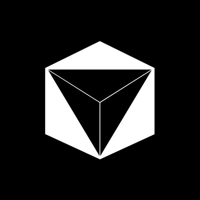
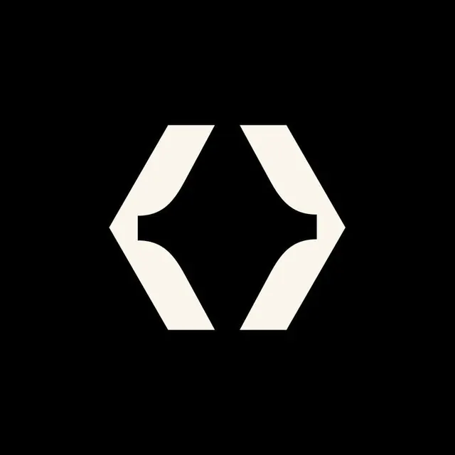
Cream-on-black logo mark of two mirrored bracket-like shapes meeting to form a hexagon, the central negative space reading as opposing curved notches.
Summary
A geometric monogram built from two solid cream shapes that mirror each other to outline a hexagon, with the gap between them carving curved notches that read as facing angle brackets or parentheses.
Visual description
Centered on a pure black field, two chunky off-white forms sit nearly edge to edge. Each is the left or right half of a hexagon, but their inner edges are scooped with an S-like curve so the slim vertical channel of black between them widens into a curved notch top and bottom. The result reads simultaneously as a hexagon split down the middle, a pair of facing brackets, and possibly an abstract C-and-reverse-C or letterpair. The shapes are flat, hard-edged, and high contrast with no outline, gradient, or texture, just figure and ground.
Key takeaway
Designing the mark so the negative-space channel is as legible as the positive shapes, letting one form carry two readings (hexagon plus brackets) at once. Solid cream on true black is a cheap way to make a flat geometric mark feel crafted and premium.
Reuse notes
Well suited to a developer tool, technical, or AI brand where the bracket reading nods to code without spelling it out. The single-color, hard-edged construction scales cleanly to favicons and app icons and inverts easily to black-on-cream. Add a wordmark for context, the mark alone is ambiguous about the company name.