Preview image. Unlock full-res
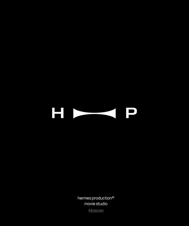
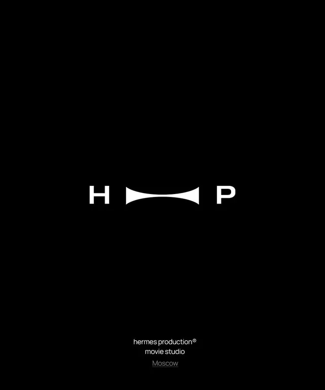
A black-ground logo for Hermes Production movie studio where an hourglass film-frame glyph sits between an H and a P, encoding the initials and the medium at once.
Summary
A logo for Hermes Production movie studio built as "H [glyph] P," where the central white hourglass shape doubles as a pinched film frame or spool. The defining move is a single concave mark that reads as both a letter-spacing device and the studio's medium.
Visual description
Centered on a pure black field, white sans-serif capitals H and P sit far apart with a custom symmetrical glyph between them: two opposed concave curves meeting in a narrow waist, like an hourglass or a stretched film frame seen edge-on. The negative space pulls the eye to the center. Far below the mark, a small two-line caption reads "hermes production (registered mark) / movie studio," and beneath it an underlined gray "Moscow" sets the location. Everything is monochrome white-on-black with generous empty space framing a compact, centered lockup.
Key takeaway
The connector glyph that earns its keep twice: it bridges the two initials as a typographic ligature and simultaneously signals film. One custom shape replacing the missing middle letters is a tighter idea than a literal camera or clapperboard icon.
Reuse notes
A model for studio and production-house marks that want to feel cinematic and premium without illustration. Black-only and reliant on a strong central glyph, so test it small and on light backgrounds before committing. The wide H-to-P gap needs space to breathe; tight layouts will fight it.