Preview image. Unlock full-res
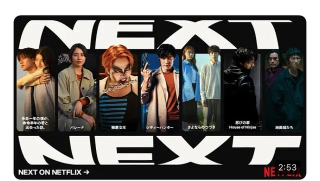
A Next On Netflix promo where two giant outlined NEXT words sandwich a horizontal filmstrip of show stills, each labeled with a title in Japanese on a dark maroon ground.
Summary
A Next On Netflix end-card layout where the word NEXT appears twice at huge scale, top and bottom, with the upper one ghosted outline and the lower one solid, clamping a single row of seven cinematic show thumbnails between them.
Visual description
The background is a deep desaturated maroon. A row of seven equal-width portrait stills runs across the center, each a moody character shot in cool blues and warm skin tones, with a small Japanese caption beneath naming the title. Above the strip, "NEXT" is set as a wide outlined display word that gets clipped by the top edge; below, "NEXT ON NETFLIX" sits with a forward arrow in solid white at the lower left. A small countdown reading "2:53" and a fragment of the Netflix "NE" mark anchor the bottom-right corner, framing this as a between-program broadcast bumper. Rounded corners suggest it is a TV-safe card.
Key takeaway
Using one repeated word at extreme scale, once as outline and once as fill, to bracket the content row and create a top-and-bottom frame without rules or boxes. The uniform filmstrip of cropped stills turns disparate titles into a single coherent lineup.
Reuse notes
A reusable pattern for streaming "coming up" cards, content roundups, or any lineup that needs to present many items as one set. The repeated-word frame scales to other CTAs (MORE, SOON, LIVE). Keep stills color-graded to a shared palette so the row reads as a unit; the countdown element only fits time-bound broadcast contexts.
More like this

Keep what you find
A free account saves references to boards and can send you a weekly email of picks based on what you save.
To see every result, go Pro.