Preview image. Unlock full-res
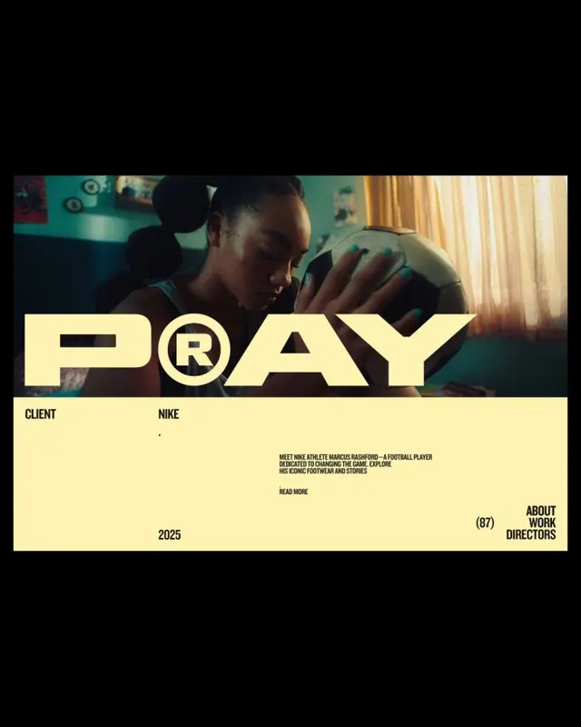
A directors-reel case-study card framing a teal-lit film still with a giant butter-yellow PRAY headline and a structured yellow credit block listing client, year and project metadata.
Summary
A film-production case-study card on a black field: a warm teal-tinted still of a young footballer cradling a ball sits letterboxed up top, crossed by an oversized butter-yellow PRAY headline whose R is set inside a circled registered-trademark mark, all anchored to a yellow credit panel below.
Visual description
The card is black with a centered horizontal photo, a moody indoor still bathed in teal and amber light. A massive condensed sans headline in butter yellow, "PRAY," straddles the bottom of the image, its R swapped for a circled R registered symbol so the word reads as a logo. Beneath, a full-width pale-yellow block holds a left-to-right metadata layout: "CLIENT / NIKE" at top left, a small running paragraph of body copy center, "READ MORE" beneath it, "2025" lower left, and a right-aligned navigation stack "(87) ABOUT WORK DIRECTORS." Everything is upper-case, tightly tracked, in black on yellow for hard contrast against the photo above.
Key takeaway
Anchoring a project headline to the bottom edge of the still so the word and the image share one optical line, then dropping the rest of the credits into a flat color block that doubles as a footer nav. The circled-R trick turns a plain word into a wordmark.
Reuse notes
A clean template for a directors' reel, studio portfolio, or campaign case study where each project gets one big word plus a tidy credit table. Works best with a strong cinematic still that can survive a bold type overlay. The single warm accent on black keeps it gallery-like; swap the yellow per project to color-code a grid of cards.
More like this


Keep what you find
A free account saves references to boards and can send you a weekly email of picks based on what you save.
To see every result, go Pro.