Preview image. Unlock full-res
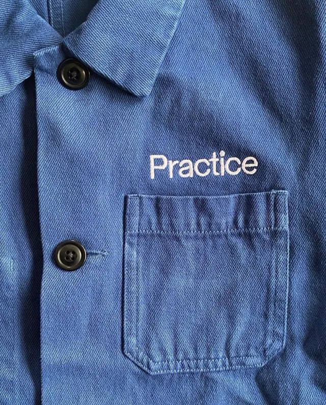
A brand wordmark presented as garment identity: the word practice in white lowercase sans-serif printed on the chest of a worn, faded indigo cotton chore jacket, positioned between the collar and a patch pocket.
Summary
A brand identity expressed through apparel: the single word practice in white lowercase sans-serif embroidered or screen-printed on the chest of a lived-in indigo cotton chore jacket, positioned above the patch pocket to let the garment's construction frame the type.
Visual description
Tight crop on the upper-left front of a faded indigo utility jacket. Two dark buttons run vertically down the left placket, and a single flap-less patch pocket sits in the lower-right quadrant with a rivet stud anchoring its corner. The fabric is soft cotton twill with visible wear: natural fold creases, faded areas where sunlight has bleached the color, and subtle shadow play from the garment's thickness. The word practice sits centered between the collar and the pocket in a clean, geometric sans-serif, set in all lowercase, in flat white that appears to be screen-printed or embroidered with tight coverage. The entire palette is monochromatic indigo: lighter washed blue in the sunlit fabric areas, deep navy in the creases and shadows, charcoal in the button color, and pure white in the printed wordmark. No secondary color, no logo mark or symbol, no additional text.
Key takeaway
Placing a wordmark directly on a real, textured, worn-in garment instead of a flat lockup makes a brand feel tangible, established, and grounded in physical culture rather than branding abstraction. The lowercase, single-weight simplicity reads as modern and confident. Positioning the type above (not on top of) the pocket creates a natural frame and alignment without interfering with the garment's functional pockets. The monochrome treatment mirrors the garment material and avoids jarring color contrast, so the type reads as belonging to the piece rather than overlaid on it.
Reuse notes
Strong template for brand identity reveals, apparel lookbooks, or merch launches for design studios, maker brands, coffee roasters, fashion labels, or creative practices going for understated, utilitarian aesthetic. The approach pairs naturally with muted earth tones, workwear, film-grain or tungsten-lit photography, and editorial-style composition. Caveat: the effect depends entirely on a genuinely well-made garment with natural patina or texture and good natural light. A flat product cutout, studio lighting, or a cheap garment destroys the entire emotional payload. This works best as a detail shot in a lookbook or contextual photo, not as a product thumbnail.