Preview image. Unlock full-res
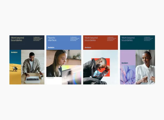
Four InVision brand posters built on a fixed top-band-plus-photo grid, each recolored (navy, blue, rust, teal) and paired with portraits and the 'work beyond boundaries' headline.
Summary
A four-poster InVision brand system where a single grid (colored headline band on top, photo block below, logo set into the band) is recolored four ways. The same shell flexes across navy, slate blue, rust, and teal variants.
Visual description
Four portrait posters in a row on a pale gray ground. Each splits into a top color band carrying a left-aligned white headline ("Work beyond boundaries", or "Face to interface") with a small right-hand sub-line, and a lower zone holding photography. The InVision wordmark sits in the band or in a tinted side column. Imagery is candid workplace portraits, a man at a laptop, a woman at a screen, a man cropped inside a red square, a woman against a purple botanical close-up. Color drives the difference: dark navy with a desert-and-yellow side strip, mid-blue with a gradient UI peek, rust orange with a red photo inset, deep teal with a lilac column. Type is a single clean sans throughout.
Key takeaway
One modular grid, recolored per variant, gives a whole campaign from a single layout. The headline band doubles as the color carrier and the logo home, so the brand colour and mark always travel together. Mixing a literal portrait with a cropped color-block inset (the red square) adds energy without breaking the system.
Reuse notes
A reliable model for a SaaS or product brand that needs many on-brand pieces fast: lock the grid, swap the accent color and photo per use. Pairs well with a strong photo library and a flexible color palette. The side-column tint variant is the most distinctive; the plain band variants are the safe default.
More like this


Keep what you find
A free account saves references to boards and can send you a weekly email of picks based on what you save.
To see every result, go Pro.