Preview image. Unlock full-res
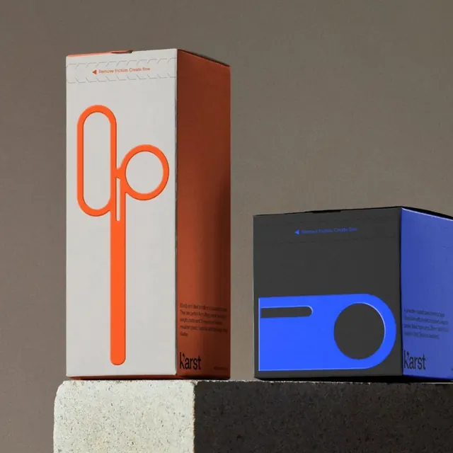
Two Karst desk-tool boxes photographed on a concrete plinth, each fronted by a single oversized outline icon (scissors in orange, tape dispenser in blue) over a half-and-half color split.
Summary
Product packaging for Karst desk tools: each box is split into two flat color planes and carries one giant outline icon of the contents, a tall scissors silhouette in orange and a tape dispenser in blue. The system reads as a connected family because the icon, not the photo, sells each product.
Visual description
Two cartons sit on a split concrete-and-charcoal block under warm directional light against a taupe backdrop. The tall box on the left pairs a cream front with a rust-brown side; a single thick-stroke orange scissors icon runs nearly its full height, with a dashed perforation graphic and the tagline "Remove friction. Create flow." along the top edge and small body copy plus the lowercase "k'arst" wordmark at the foot. The shorter right box swaps to a blue front and black side with an outlined tape-dispenser icon and the same top tagline and bottom wordmark. Each face is a clean two-color block, no photography of the product itself.
Key takeaway
Representing the product as one oversized single-line icon instead of a photo, so a whole range stays instantly recognizable while each item gets its own accent color. The repeated top tagline strip and bottom wordmark lock the family together across different hues.
Reuse notes
Strong reference for a stationery, hardware, or DTC range that needs shelf consistency across many SKUs. The icon-per-product approach scales cheaply: design the grid and tagline strip once, then swap icon and accent color per item. Needs flat, confident color and a single hero icon to work; busy art would break it.
More like this


Keep what you find
A free account saves references to boards and can send you a weekly email of picks based on what you save.
To see every result, go Pro.