Preview image. Unlock full-res
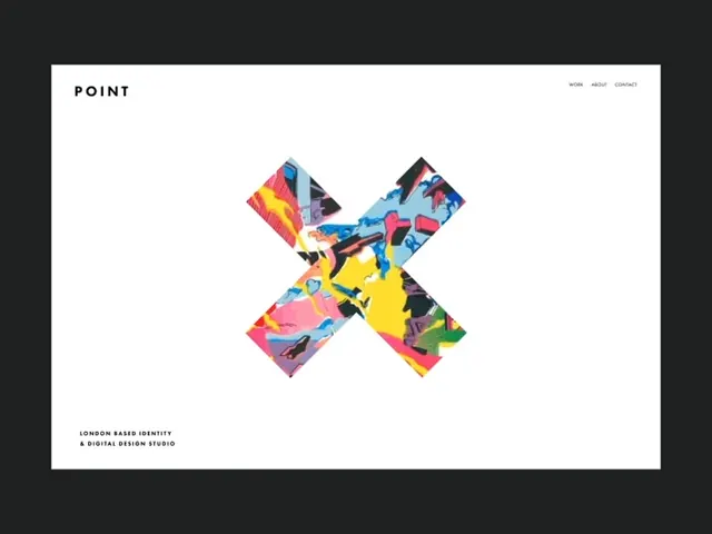
Design studio identity with textured photographic X-mark logo composed of four rotating photo tiles in vibrant colors, paired with minimal sans-serif wordmark on white background.
Summary
Design studio branding featuring a rotated X-mark composed of four photo tiles with saturated, textured color palettes, paired with a clean lowercase wordmark on white.
Visual description
A white poster-style layout with the studio name "POINT" in minimal sans-serif at top-left. The focal mark is a centered, rotated X composed of four tilted square photo tiles, each filled with vibrant, abstract photographic textures: one tile shows warm oranges and reds, another bright yellows, a third combines magentas and blues, and the fourth contains dark purples and blacks. The tiles align at the center to form the X shape. Bottom-left attribution reads "LONDON BASED IDENTITY" and "A DIGITAL DESIGN STUDIO" in small uppercase sans-serif.
Key takeaway
The rotating tile technique creates visual movement and energy while showcasing photographic texture within a geometric mark. The rotation breaks the grid and feels contemporary. The minimal wordmark + photo texture pairing balances restraint with visual richness, making the logo memorable without clutter.
Reuse notes
Strong for creative studios, agencies, and design-forward brands that want to feel energetic but maintain legibility. The textured photographic element works well when you have authentic imagery to showcase. The rotation adds playfulness without sacrificing professional credibility.