Preview image. Unlock full-res
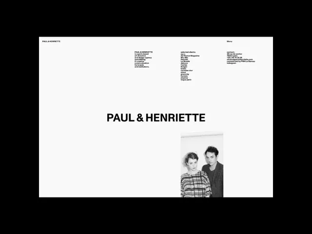
A near-empty black-on-white agency homepage that anchors a bold centered PAUL & HENRIETTE wordmark with small left-aligned blurb and client columns, plus one black-and-white founder portrait.
Summary
A Paris art-direction studio homepage built almost entirely from white space, with the large all-caps "PAUL & HENRIETTE" wordmark centered low on the page and everything else reduced to tiny supporting text blocks.
Visual description
The page has a thin top bar with the studio name at far left and "Menu" at far right. Below, three small tightly-set text columns sit mid-canvas: a left blurb describing the Paris-based art direction and design agency, a center "selected clients" list (a.p.c., Air France Magazine, Miu Miu, Hermes, Le Monde, Cartier, Bvlgari, and more), and a right contact block with address and email. The oversized bold sans-serif wordmark dominates the lower third. A single small black-and-white photograph of two people, presumably the founders, sits to the lower right, the only image and the only break in the otherwise empty white field.
Key takeaway
The confidence of leaving most of the viewport blank and letting one big centered wordmark plus a few 9-point text clusters carry the entire page. Pinning the client list as a dense small-caps column so prestige names read as quiet proof rather than a logo wall.
Reuse notes
Ideal for a fashion-adjacent studio, design agency, or photographer who wants understatement to signal taste. Works only with genuinely strong client names or one striking portrait to justify the emptiness. Best on a true white ground at large viewport widths; the airiness collapses on small screens unless reflowed.
More like this




Keep what you find
A free account saves references to boards and can send you a weekly email of picks based on what you save.
To see every result, go Pro.