Preview image. Unlock full-res
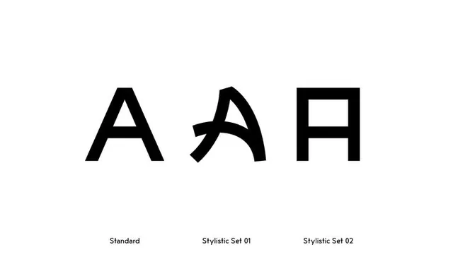
A stark black-on-white type specimen showing one capital A in three forms, labeled Standard, Stylistic Set 01 and Stylistic Set 02, to demonstrate alternate glyph cuts.
Summary
A clean specimen sheet that places one oversized capital A three times in a row, each a different cut, captioned Standard, Stylistic Set 01 and Stylistic Set 02 to show how alternate glyphs reshape the same letter.
Visual description
Three large black letterforms sit centered on a white field, evenly spaced in a single horizontal row. The first is a conventional triangular sans-serif A with a level crossbar. The second swaps in a swash, calligraphic A with a curved tail sweeping down to the right. The third is a squared, slab-like A built from straight verticals and a flat top, almost a closed rectangle. A small gray sans-serif caption sits beneath each glyph naming it. Everything else is empty white space, so the comparison reads as a controlled before-and-after of one OpenType feature.
Key takeaway
Demo a typeface's stylistic sets by repeating a single distinctive glyph side by side under plain labels, rather than setting full words. The minimal black-on-white frame makes the difference between cuts the only thing on screen.
Reuse notes
Use this format on a foundry page, font landing page or brand type-spec slide when you need to prove a face has personality through its alternates. Works best with a letter that changes dramatically across sets (A, G, R, Q). Keep the background empty so the glyphs do all the talking.
More like this






Keep what you find
A free account saves references to boards and can send you a weekly email of picks based on what you save.
To see every result, go Pro.