Preview image. Unlock full-res
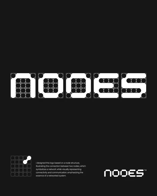
A black-on-white logo presentation for NODES, where each letter is constructed from a 4x4 grid of circles, shown with construction marks and a finished refined wordmark.
Summary
A logo case study for the "NODES" wordmark on deep black, showing each letter built from a square grid of solid circles plus its construction guides, with the cleaned-up final lockup at the bottom.
Visual description
On a near-black ground, the lowercase "nodes" wordmark runs large across the middle, each glyph drawn inside its own square cell as a pattern of solid white blocks and circular dots over a faint construction grid, so the letters read as pixel-and-node assemblies rather than smooth type. Bottom left, a single grid cell is enlarged to show the core idea: two white dots joined by a connector, the "node" motif. A short paragraph of white body copy beside it explains the network rationale. Bottom right sits the resolved production wordmark, the same letters cleaned of grid lines into a smooth rounded-rectangle tech face, with a small TM. The piece walks from system to construction to final mark in one frame.
Key takeaway
Generating an entire custom typeface from one repeated module (a circle on a grid), so the logo visibly embodies its own concept, here a connected network of nodes. Presenting the build by showing the construction grid and an exploded single glyph next to the finished mark, which makes the rationale self-evident.
Reuse notes
Ideal reference for a tech, infrastructure, or data brand that wants a logo whose form literally argues its concept. The split-screen layout (constructed version up top, refined lockup and reasoning below) is a reusable template for presenting any grid-built mark. Works best in stark monochrome so the grid logic stays readable.