Preview image. Unlock full-res
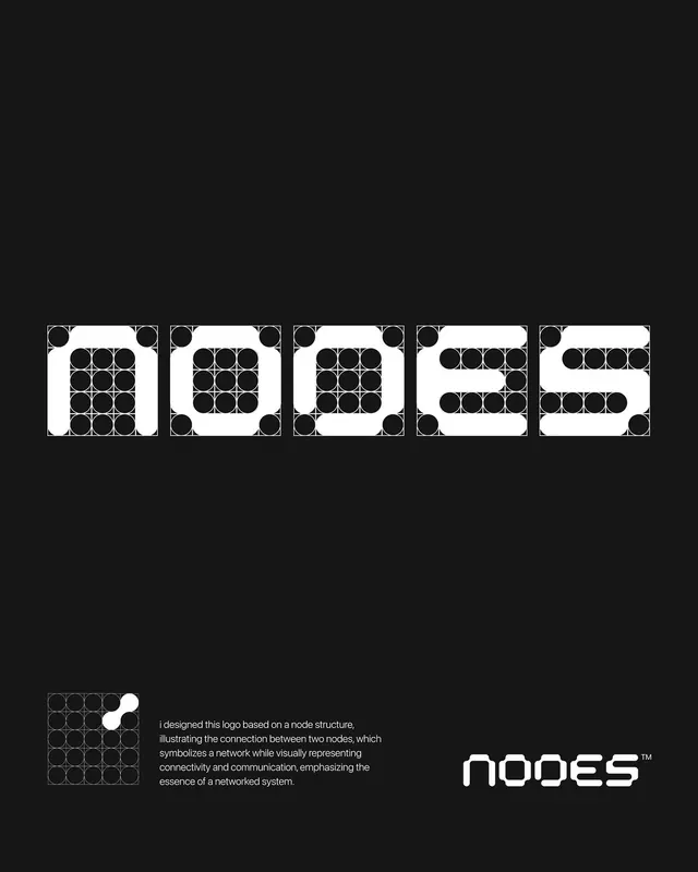
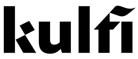
Bold geometric sans-serif wordmark with rotated rectangular forms creating an optically-varied, modern identity.
Summary
Bold geometric wordmark using rotated rectangular letter elements in a clean sans-serif, each form tilted at different angles to create rhythm and visual tension.
Visual description
Five solid black letterforms arranged horizontally on white. Each letter consists of simple rectangular or near-trapezoidal shapes arranged in a sans-serif family. The second and final letters are rotated or skewed slightly, creating dynamic visual movement. The composition is tightly letterspaced, creating a unified block with high contrast between the black forms and white background.
Key takeaway
Minimal geometric letterforms where rotation and negative space replace curves. The technique works for technical, forward-thinking brands needing impact with mechanical simplicity. Each letter retains legibility while contributing to overall visual rhythm.
Reuse notes
Strong for tech, manufacturing, or design-focused brands that need a modern, precise wordmark. Black-and-white limits colorway flexibility but ensures maximum contrast and reproduction clarity across media.