Preview image. Unlock full-res
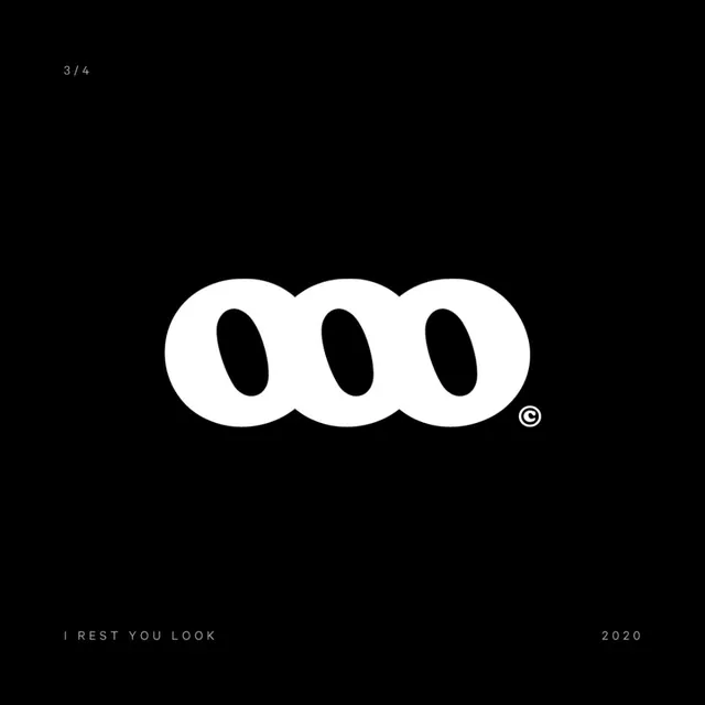
A bold monogram of three overlapping rounded rings forming a continuous 'ooo' shape in solid white, centered on a black field with small caption type.
Summary
A heavy white monogram of three rounded rings overlapping left to right, reading as a continuous "ooo" with negative-space ovals punched through each ring, presented as a single mark on a black field. The defining move is using overlap and counter-shape to fuse three letterforms into one solid, chunky logo.
Visual description
The mark is centered and oversized against pure black. Three fat rounded rings sit on a shared baseline and overlap so their outer edges merge into one bean-like silhouette, while each ring keeps a tilted oval counter that lets the black ground read through. The stroke is very thick and the corners fully rounded, giving the form a soft, almost inflated weight. A tiny circled copyright mark tucks against the lower-right edge of the last ring. Caption type is set small and widely letter-spaced in a light all-caps sans: "3 / 4" top-left, "I REST YOU LOOK" bottom-left, and "2020" bottom-right. The contrast is total: solid white mark, black field, grey-toned thin captions framing the composition.
Key takeaway
Overlapping identical rounded forms so their counters become the only negative space is a clean way to build a repeatable, chunky monogram. Floating the mark large and alone on black with whisper-quiet tracked captions in the corners is a presentation grammar worth reusing for any logo reveal. The single circled copyright glyph at the mark's edge adds an authored, finished touch.
Reuse notes
Reach for this when presenting a single logo on a portfolio slide or case-study cover and you want the mark to dominate. The overlapping-ring construction suits a studio, collective, or tech brand wanting a friendly-yet-bold abstract mark. Pairs well with thin tracked sans captions for an art-direction feel. Caveat: the heavy rounded silhouette needs enough size to keep its counters legible, and it leans graphic-design-insider, so it may read as too arty for conservative corporate clients.