Preview image. Unlock full-res
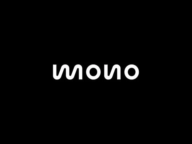
A lowercase 'mono' wordmark in white rounded-terminal sans on black, where the m, u and n share one continuous wave so the word reads almost symmetrically.
Summary
A lowercase "mono" wordmark set in a white monoline sans on a pure black field, where the opening m flows as a continuous wave into the following letters so the word reads almost as a single drawn stroke.
Visual description
The mark sits dead-center on an unbroken black background with generous margins on all sides. Every letter is built from a single even-weight line with fully rounded terminals and circular bowls, so the m, the n and the two o forms feel cut from one ribbon. The m is drawn as a flowing double-hump wave rather than vertical stems, mirroring the rounded n at the other end, which gives the wordmark a near-symmetrical, palindromic rhythm. No tagline, no icon, no secondary type.
Key takeaway
Build a wordmark from one constant-width monoline with circular geometry so individual letters merge into a single continuous gesture. Redrawing the m as a wave that rhymes with the n turns an ordinary word into a quasi-symmetrical mark without adding any graphic element.
Reuse notes
Strong for a tech, audio, or developer brand wanting a friendly-yet-precise lowercase logotype. The rounded monoline reads best large and on dark; at small sizes the merged strokes can blur, so pair with a heavier or more separated version for favicons.
More like this






Keep what you find
A free account saves references to boards and can send you a weekly email of picks based on what you save.
To see every result, go Pro.