Preview image. Unlock full-res
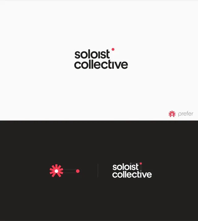
Branding system for a creative collective, pairing a bold sans-serif wordmark with a geometric accent mark and modular logo system.
Summary
Branding for Soloist Collective pairs an understated black lowercase wordmark with a single bright red dot, shown in a two-mode layout with the mark alone on white and the mark plus a geometric red symbol on dark.
Visual description
Two branding contexts shown vertically. The top half sets black stacked text "soloist / collective" centered in bright white space with one small red dot floating above the type. The bottom half shifts to a charcoal background and shows a modular system: a larger red six-pointed star-like mark with connecting accent circles on the left, then the wordmark repeated in white with another red dot on the right, separated by a subtle rule.
Key takeaway
The restraint of one accent color doing all the work. The mark is geometrically minimal (a shape + dots) yet distinctive enough to anchor the system. The two-mode usage (mark alone vs. with wordmark) shows flexibility without complexity.
Reuse notes
Effective for creative or professional services brands that need to feel both approachable and confident. The monochrome base lets the single red accent carry all emotional weight, making the identity scalable to small and large sizes. The geometric mark translates well to icon, social avatar, or favicon contexts.
More like this








Keep what you find
A free account saves references to boards and can send you a weekly email of picks based on what you save.
To see every result, go Pro.