Preview image. Unlock full-res
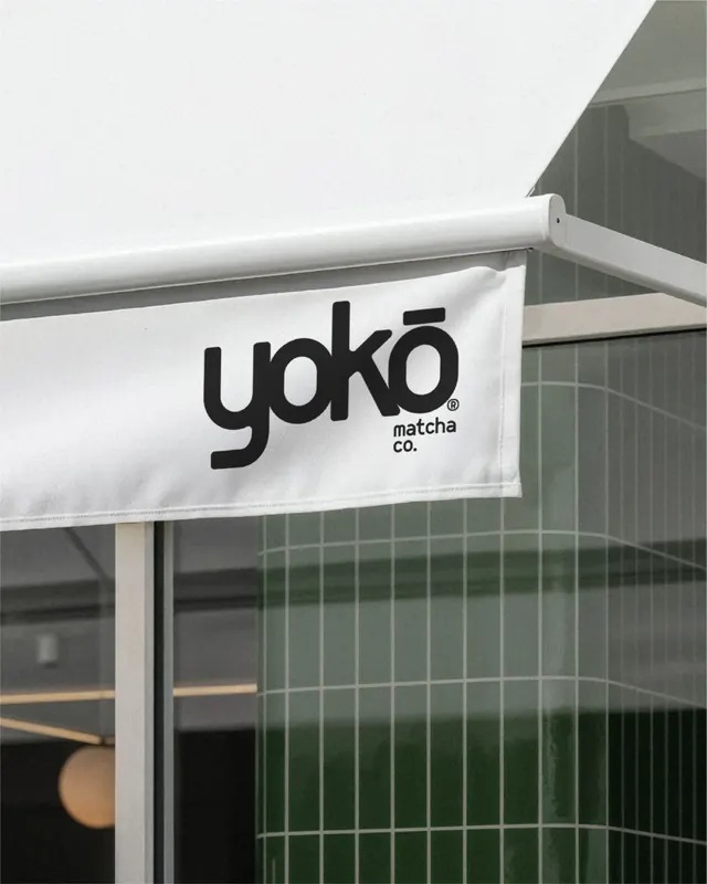
A monochrome storefront awning displays a bold black wordmark reading \"yoko\" with smaller \"matcha co.\" underneath.
Summary
A monochrome storefront awning displays a bold black wordmark reading "yoko" with smaller "matcha co." underneath.
Visual description
A white fabric awning fills most of the frame, with a large black lowercase wordmark centered on the hanging panel and smaller text below it. The background shows a tiled glass facade and part of a metal support arm, all rendered in a soft gray, desaturated palette.
Key takeaway
Use oversized, highly simplified wordmark placement on a neutral physical surface to make the brand feel immediate and confident. Keeping the palette nearly monochrome sharpens the contrast and makes the typography do the work.
Reuse notes
Works well for premium food, retail, or hospitality brands that want a quiet but memorable exterior presence. Reach for this when the goal is to make signage feel editorial and restrained rather than loud.