Preview image. Unlock full-res
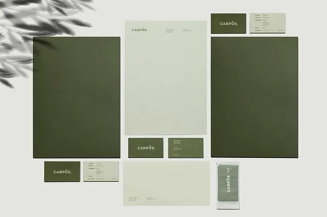
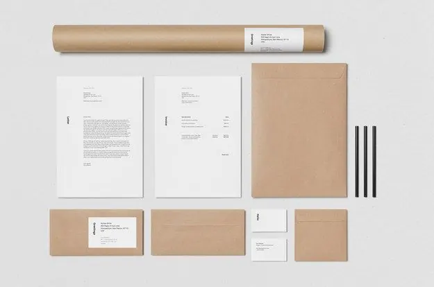
A minimalist stationery identity presentation shows a kraft paper mailing tube, two letterhead pages, an envelope, cards, and pens arranged on a light gray surface.
Summary
A minimalist stationery identity presentation shows a kraft paper mailing tube, two letterhead pages, an envelope, cards, and pens arranged on a light gray surface.
Visual description
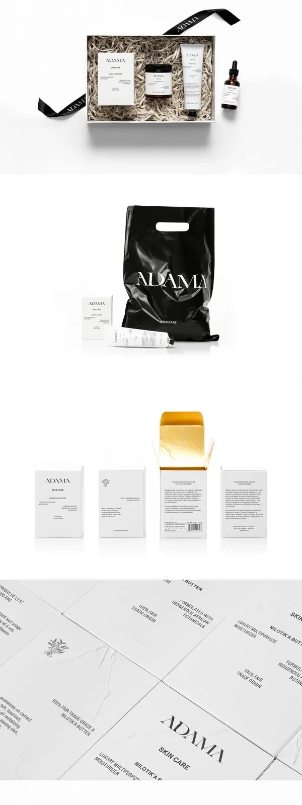
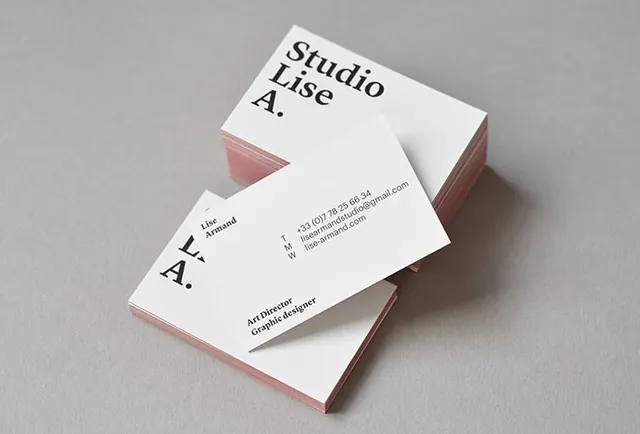
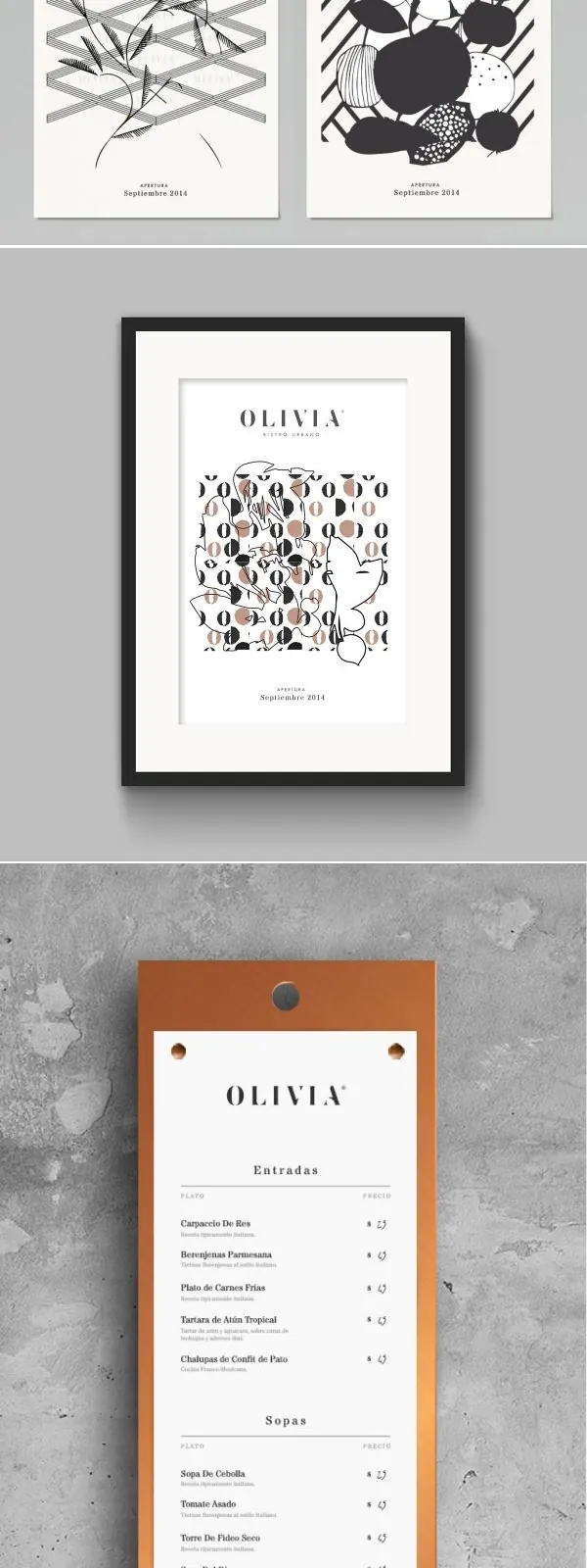
The image shows a stationery suite laid out on a pale textured background. A long kraft paper tube sits at the top, two white document sheets are centered below it, and a large kraft envelope, two black pens, cards, and smaller paper pieces are arranged in a neat grid beneath.
Key takeaway
Use restrained materials, lots of negative space, and a grid-based presentation to make the identity feel precise and premium. The contrast between crisp white paper and warm kraft stock gives the system a tactile, understated character.
Reuse notes
Reach for this when presenting a brand identity, stationery system, or print collateral mockup that should feel refined and minimal. It works well for premium service brands, studios, and any project where material quality is part of the story.