Preview image. Unlock full-res
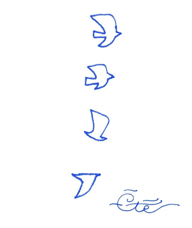
Four loose blue ballpoint outlines of birds in flight descend down the page, ending in a single curling script flourish, all drawn freehand on plain white.
Summary
Four freehand blue-pen birds shown mid-flight, each a single open outline, stepping down the page from a full spread-wing shape to a near-abstract checkmark, then resolved with a curling script flourish in the lower right.
Visual description
On a plain white ground, a vertical sequence of four bird forms is drawn in royal-blue ballpoint with a slightly textured, hand-pressed line. The top bird is the most complete, two raised wings and a forked tail; each one below is progressively simplified until the last reads almost as a single angular swoosh, charting a small evolution from literal to mark. The strokes stay open and gestural, never filled. Bottom-right sits a separate flourish, a looping connected script terminating in a long flat tail-stroke, like a signature or maker's mark. Everything is the same one blue; the white space between the elements is loose and uneven, giving a sketchbook, in-progress feel rather than a finished lockup.
Key takeaway
The reduction study itself: drawing the same subject four times, each looser than the last, is exactly how you arrive at a simple logo bird, and the sheet of variants is worth keeping as a method, not just an image. The single curling flourish is a ready-made handwritten accent to pair with a clean logotype.
Reuse notes
Use as process inspiration when developing a minimal animal or bird mark, or as a hand-drawn texture/accent layered over otherwise clean branding for warmth. The ballpoint line and uneven spacing read as authentic and casual, so it suits boutique, artisanal, or personal brands more than corporate ones. It is a sketch, not a vector, so any element here would need redrawing or tracing to become a usable mark.