Preview image. Unlock full-res
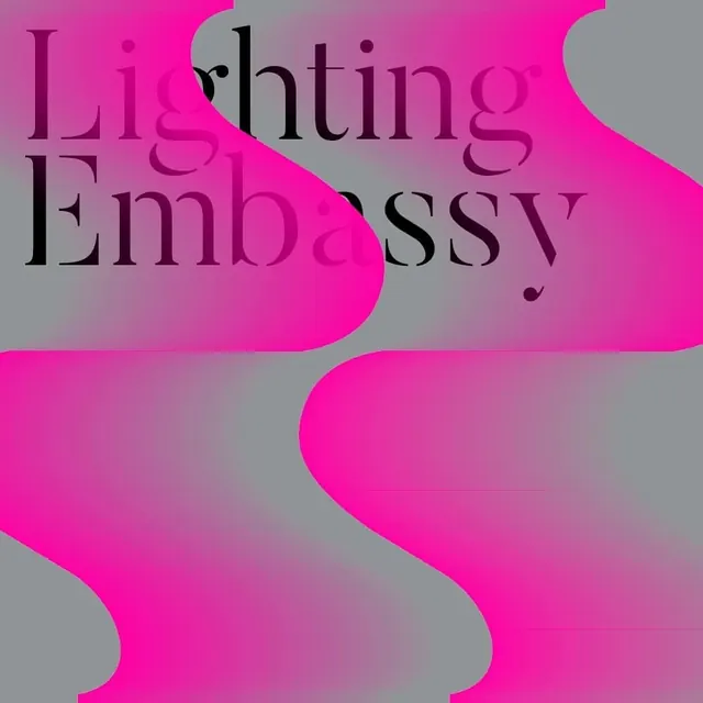
A square cover where wavy magenta-to-grey gradient bands ripple across the frame behind the serif words Lighting Embassy set in black at top left.
Summary
A square cover dominated by soft, blurred gradient ribbons sweeping from hot magenta into neutral grey, with the title Lighting Embassy set in a black serif at the upper left.
Visual description
Three wide S-curved bands of color undulate vertically down the frame. Their edges are heavily blurred so magenta, dusty pink and cool grey bleed into one another without hard boundaries, reading like out-of-focus light or fabric. The bands alternate a vivid hot-pink core with muted grey troughs, giving a glowing, almost backlit quality. Over the top-left corner, "Lighting / Embassy" is set across two lines in a black high-contrast serif, the dark type cutting cleanly against the bright gradient. The composition is otherwise empty, letting the wave fill the square.
Key takeaway
Pairing a soft, defocused color gradient with a crisp high-contrast serif: the blur makes the type feel sharper by contrast, and the dark serif keeps a glowing background from looking like a stock wallpaper. The S-curve ribbon structure gives an abstract gradient direction and rhythm instead of a flat wash.
Reuse notes
Reach for this on a cover, hero, or title card where you want warmth and glow without imagery, common for lighting, beauty, events, or media brands. The blurred gradient is easy to recolor; keep one strong saturated band against neutral troughs so it does not turn muddy, and anchor it with dark, structured type.
More like this

Keep what you find
A free account saves references to boards and can send you a weekly email of picks based on what you save.
To see every result, go Pro.