Preview image. Unlock full-res
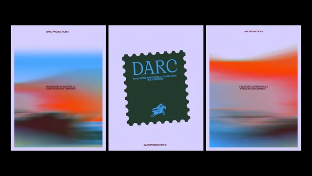
A three-poster brand triptych for DARC Production, pairing motion-blurred sunset gradients on the outer panels with a die-cut postage-stamp logo lockup at the center.
Summary
Three portrait posters shown side by side for "DARC Production", where the left and right panels carry smeared, motion-blurred sunset gradients and the central panel sits a green postage-stamp emblem on a pale lavender ground.
Visual description
All three posters share a lavender background and a small bordeaux all-caps wordmark, "DARC PRODUCTION", with a copyright glyph. The outer two are filled with horizontal, motion-blurred bands of orange, blue and teal that read like a dragged photo of a horizon, each carrying a short centered line of French copy ("NOUS IRONS AU BOUT DE LA TERRE POUR NOS TERROIRS", "L'ELAN DE LA CREATION, LA FORCE DU DEVOUEMENT"). The middle poster is mostly empty lavender with a single dark-green perforated postage-stamp shape at center; inside it sits a bright-blue serif "DARC" over a tagline and a small knight-on-horseback line emblem. The whole set is presented on a black surround as a hanging triptych.
Key takeaway
Anchor a flat, restrained layout system with one tactile motif, here a die-cut perforated stamp, and let two blurred gradient fields supply all the energy and color. Repeat a fixed wordmark and corner mark across every panel so the posters read as a series even when the imagery changes completely.
Reuse notes
Good reference for production houses, wine and terroir brands, cultural studios, or campaign series that need a flexible poster system. The motion-blur gradient is easy to generate and rethemes per piece while the stamp emblem holds the identity constant. Works as a triptych or as standalone posters; the perforated-stamp center makes the natural hero or cover.
More like this

Keep what you find
A free account saves references to boards and can send you a weekly email of picks based on what you save.
To see every result, go Pro.