Preview image. Unlock full-res
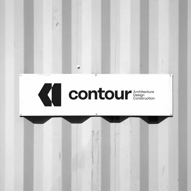
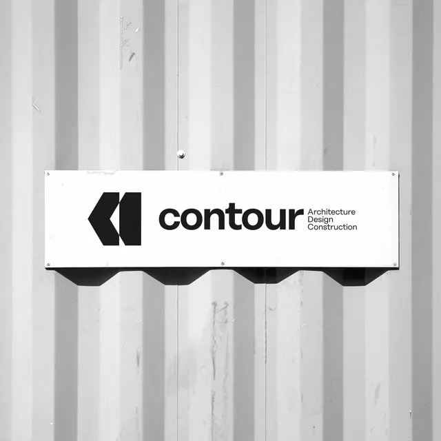
A black-and-white brand sign mounted on a corrugated metal wall shows a bold logo mark, the word \"contour,\" and stacked service text.
Summary
A black-and-white brand sign mounted on a corrugated metal wall shows a bold logo mark, the word "contour," and stacked service text.
Visual description
The image shows a rectangular white sign fixed to a corrugated metal wall, with a dark geometric logo mark on the left and the word "contour" in large lowercase type across the middle. To the right of the wordmark is a compact stacked list reading Architecture, Design, Construction, with visible mounting screws and a shadow beneath the sign.
Key takeaway
Use one strong geometric mark paired with a heavy lowercase wordmark, then tuck supporting descriptor text into a tight secondary column. The large amount of empty sign field gives the identity a clean, confident presence.
Reuse notes
This works well for architecture, design, and construction brands that need a restrained, premium exterior sign or identity board. Reach for it when the logo has to read fast from a distance and the supporting services can stay secondary.