Preview image. Unlock full-res
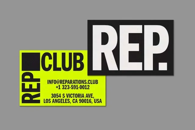
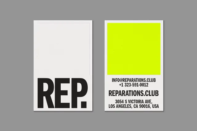
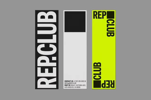
A bold identity layout shows three vertical REPCLUB-related panels with oversized typography and high-contrast blocks.
Summary
A bold identity layout shows three vertical REPCLUB-related panels with oversized typography and high-contrast blocks.
Visual description
The image shows three tall vertical design panels on a gray background. The left panel is black with huge white stacked letters reading REPCLUB, the center panel is mostly off-white with a black square at the top and small contact text at the bottom, and the right panel is neon yellow-green with black REPCLUB text arranged vertically and horizontally.
Key takeaway
Use oversized vertical type as the primary visual structure, then break it with a single simple block or panel for contrast. A limited palette with one neon accent makes the identity feel immediate and memorable.
Reuse notes
Reach for this when you need a poster-like brand system, cover, or promo sheet that has to read instantly from a distance. It works best for identities that want to feel loud, modern, and grid-driven without adding illustration or decoration.