Preview image. Unlock full-res
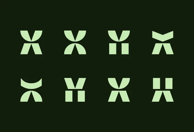
Eight variations of a geometric symbol system using pale green and dark green angular shapes on a dark forest background.
Summary
Eight variations of a geometric symbol system using pale green and dark green angular shapes on a dark forest background.
Visual description
The composition presents a 2x4 grid of modular logo marks, each constructed from angular geometric primitives. The pale mint-green fill color is consistent across all variations; the dark forest background amplifies contrast. The top row shows four distinct mark variations: the first and fourth are symmetrical V-forms split vertically; the second combines a curved cap with parallel rectangular shapes; the third is purely rectangular. The bottom row repeats the top row with different configurations, suggesting systematic variation within a constrained design language. Each mark is precisely spaced and centered within its grid cell, emphasizing the design system's rigor and scalability.
Key takeaway
The modular approach: each shape (curved cap, trapezoid, rectangle, parallel lines) can be combined and reordered to create new marks while maintaining brand consistency. The pale green on deep background creates premium contrast without relying on high saturation. The grid presentation itself demonstrates flexibility and production-ready thinking, showing that the system scales and adapts methodically.
Reuse notes
Excellent reference for corporate identity systems or app icon suites where a family of marks needs to feel cohesive. The cool green palette suggests tech, sustainability, or growth verticals. Use when the client values precision, modularity, and a calm, sophisticated tone. The high contrast works well across digital and print applications.