Preview image. Unlock full-res
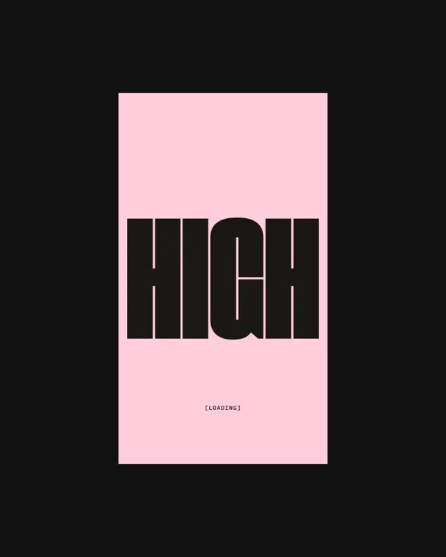
A minimal loading screen interface with the word "HIGH" in outlined geometric type, loading text, and a progress bar on soft pink.

Summary
A loading state UI design combining heavy outlined sans-serif type ("HIGH"), secondary status text ("[LOADING]"), and a linear progress indicator on a soft pink background.
Visual description
Centered on a light pink rectangular field is the word "HIGH" rendered in a thick, geometric sans-serif typeface with white outlines creating negative space inside the letterforms. Below this, in smaller all-caps sans-serif, the text "[LOADING]" appears. Beneath that sits a horizontal loading bar—a thin line with segmented marks. All elements are centered vertically and horizontally on the field, with generous whitespace surrounding them.
Key takeaway
Minimalist loading interface: the outlined type style (white stroke on dark form) creates sophistication and visual interest despite extreme simplicity. The progression from large headline to status text to progress indicator establishes clear hierarchy for a transient screen state.
Reuse notes
Effective for brand-forward loading screens where personality and type treatment matter more than realistic progress meters. The outlined stroke technique works on soft backgrounds and pairs well with modern, confident typefaces. Note that this is a mockup/concept—real implementations need functional progress behavior.