Preview image. Unlock full-res
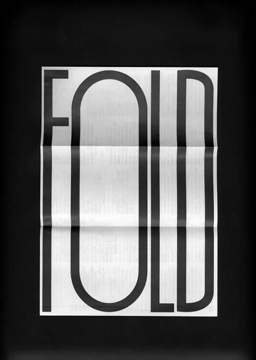
Bold white wordmark spelling "JOL" in thick outlined parallel-line letterforms against a black background.

Summary
A striking wordmark composed of the letters "JOL" rendered as thick outlined forms using parallel lines, displayed in white on a black background.
Visual description
Three letterforms spell out "JOL" using a consistent technique of nested parallel strokes that create depth and visual weight. Each letter features rounded corners and double- or triple-line construction, giving them a tubular, three-dimensional appearance. The tight geometric structure and stark white-on-black contrast make the wordmark highly legible.
Key takeaway
The parallel-line technique creates visual depth and sophistication without abandoning simplicity. The identical stroke treatment across all three letters unifies them into a cohesive mark.
Reuse notes
Best suited for creative, tech, or agency brands seeking a modern, geometric identity. The technique works well at small sizes (favicon) and large scales. The bold letterforms demand plenty of breathing room and pair well with minimal layouts.