Preview image. Unlock full-res
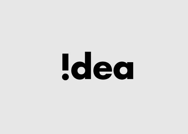
Minimalist wordmark with a period preceding the word 'idea' in bold, black sans-serif typeface on a light background.
Summary
A minimalist wordmark using a simple period followed by the word "idea" in bold, black sans-serif on a neutral background.
Visual description
The design consists of a small black period (full stop) positioned before the lowercase word "idea" rendered in a heavy, geometric sans-serif typeface. Centered on a light gray background with generous white space around it. All elements are pure black on white/neutral, creating stark, high-contrast simplicity.
Key takeaway
The unexpected placement of a punctuation mark as a prefix creates a distinctive visual hook while maintaining extreme legibility. The bold weight of the typeface ensures the mark reads as intentional branding, not accidental.
Reuse notes
Effective for brands in creative, tech, or media industries where a single distinctive mark can signal innovation. The punctuation prefix adds memorability without being overly designed. Works well at all scales due to the clarity and weight.