Preview image. Unlock full-res
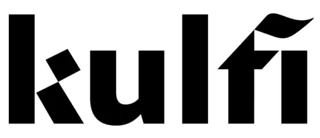
A monochromatic Helvetica-based wordmark using bold, fluid gestural strokes to articulate the letterforms while maintaining legibility.
Summary
A monochromatic Helvetica-based wordmark using bold, fluid gestural strokes to articulate the letterforms while maintaining legibility.
Visual description
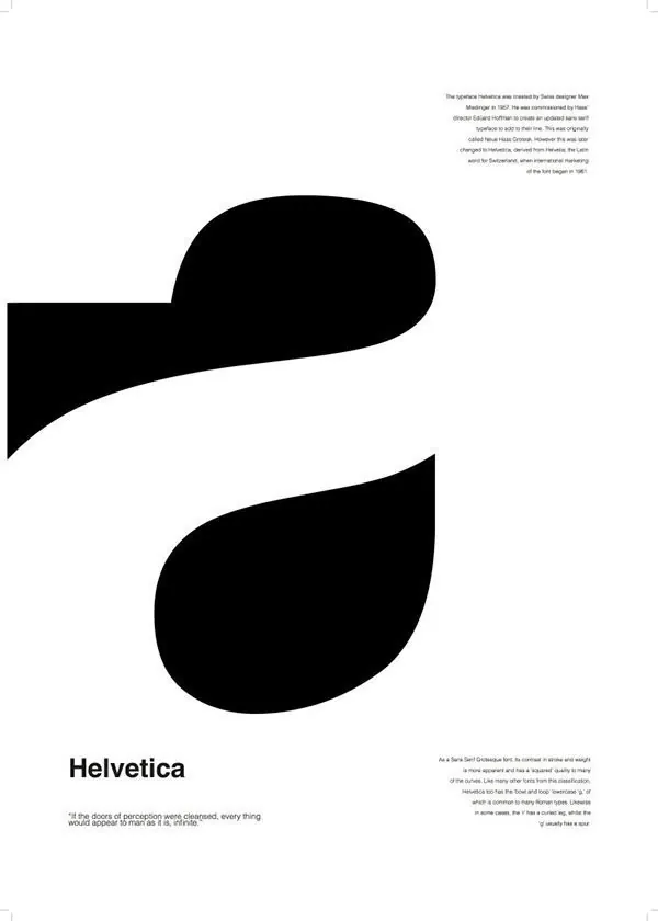
The design demonstrates Helvetica's historical letterforms rendered as thick, flowing black strokes against white with gray supporting text. The upper section shows the wordmark in black, occupying roughly 40 percent of the composition. Below sits Helvetica in full weight, anchored left. Italic footnote text on the right discusses the typeface's history. The bottom third features the word "Helvetica" in large, bold sans-serif, with smaller body copy explaining the design's philosophy.
Key takeaway
The wordmark isolates stroke weight variation within a classic typeface to create rhythm and personality. The pairing of the mark with its full-font reference shows design-system thinking. The use of negative space (the curved paths between thick strokes) creates visual interest without breaking the monochromatic language.
Reuse notes
Strong for corporate or tech branding that needs a typographic anchor with gestural warmth. Works best at large sizes where stroke variation reads clearly. Pair with Helvetica or a clean sans for consistency. Not suitable for small-scale applications or signage where thinner strokes may disappear.