Preview image. Unlock full-res
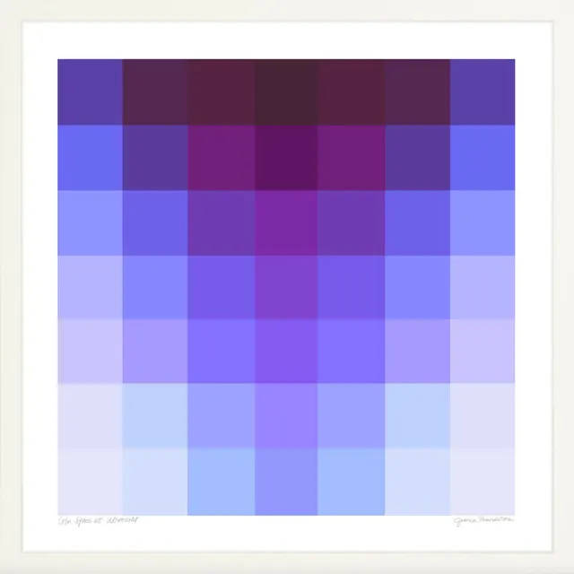
Framed fine-art print titled Color Space 68 Ultraviolet, a 7x7 grid of flat purple-to-blue squares fading from dark plum at top to pale lilac at the base.
Summary
A framed gallery print, Color Space 68 Ultraviolet, built as a 7x7 grid of solid color squares ramping from deep plum-violet at the top to near-white lilac at the bottom.
Visual description
The artwork is a square matrix of forty-nine flat-filled cells set inside a thick white mat and a plain white frame. The vertical axis carries the strongest shift: the top row reads dark, saturated plum and aubergine, while each lower row steps lighter until the bottom rows are pale periwinkle and almost-white blue. The horizontal axis adds a gentler bow, with the central columns slightly more magenta-purple than the cooler blue edges, so the densest color pools in the upper-middle of the grid. Cells abut edge to edge with no gaps or gridlines, the transitions reading as discrete blocks rather than a smooth blend. A handwritten title sits at the lower left of the mat and a handwritten signature at the lower right.
Key takeaway
Build a palette as a literal stepped grid instead of a continuous gradient: discrete swatches let the eye read each tone while still implying a smooth ramp. Loading saturation into the top rows and draining it downward gives a flat color field clear directional weight and a horizon-like anchor.
Reuse notes
A clean reference for color-system documentation, swatch walls, brand palette boards, or editorial section breaks where you want tonal range shown as an inventory. The handwritten caption-and-signature framing also works as a template for presenting a named palette as an "edition." Reads cool and contemplative, so pair with restrained type.
More like this







Keep what you find
A free account saves references to boards and can send you a weekly email of picks based on what you save.
To see every result, go Pro.