Preview image. Unlock full-res
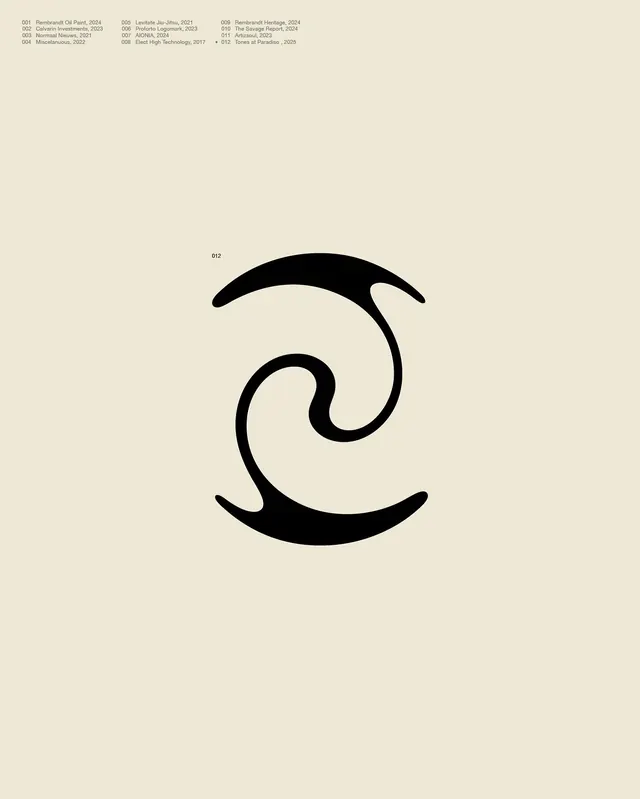
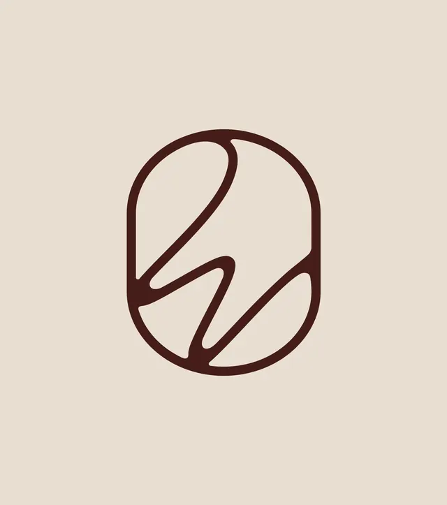
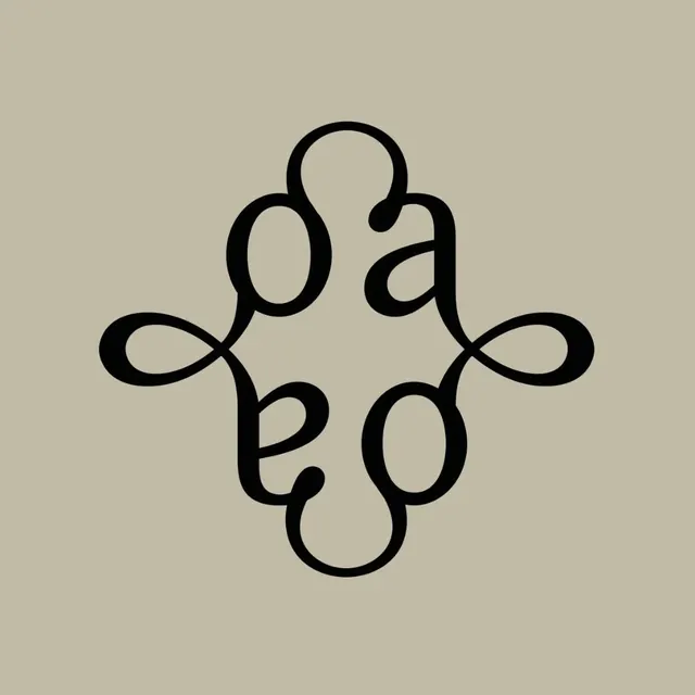
A black monoline logo mark on warm taupe where looping calligraphic letterforms interlace into a vertically symmetrical, diamond-shaped knot with four outward flourishes.
Summary
A black, flowing logo mark centered on a warm taupe ground, built from looping calligraphic strokes that weave into a vertically symmetrical, diamond-like knot. Loop-shaped letterforms (reading like interlaced a's and e's or o's) mirror top-to-bottom, with two teardrop flourishes spinning off the left and right points.
Visual description
The mark is a single family of curving, ribbon-like strokes with noticeable thick-to-thin modulation, like pointed-pen calligraphy. The strokes interlock into a tall diamond/almond silhouette: a large loop and a small loop in the upper half are mirrored by the same forms inverted in the lower half, producing top-bottom symmetry. From the left and right midpoints, the line spirals out into two small teardrop loops that act as decorative flourishes and balance the composition horizontally. It sits dead-center on a flat, slightly warm grey-beige field with wide margins all around, no type and no container.
Key takeaway
Reflecting a few calligraphic letterforms across a horizontal axis to build a self-contained, almost ambigram-like knot, so a couple of letters become an ornate, balanced emblem. The thick-thin stroke contrast inside an otherwise monoline loop gives it a crafted, hand-drawn richness while staying simple. Pairing the black mark with a muted earthy ground rather than white reads instantly as boutique and premium.
Reuse notes
Best for a heritage, beauty, fashion, hospitality, or artisan brand wanting an elegant monogram or maker's mark. The symmetry makes it work as a seal, stamp, embossing, or repeated pattern unit. Caveat: the interlaced loops make the underlying letters hard to read as specific characters, so it functions more as an abstract emblem than a legible monogram, and the fine stroke transitions need decent reproduction size.