Preview image. Unlock full-res
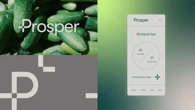
Prosper brand identity merges a geometric plus-mark logo with organic food photography and a mobile app interface displaying biological age metrics in calm taupe and green tones.
Summary
The Prosper brand identity pairs a minimal plus-mark logo with lush produce photography and a mobile app UI that tracks biological age using clean data visualization, unifying wellness science and minimalist design through earthy green and taupe tones.
Visual description
Left third: Close-up photograph of fresh green cucumbers with dew, overlaid with a large geometric plus symbol in cream/off-white. Center: Partial large plus-mark logo extending from left image into a dark taupe vertical band, establishing visual continuity. Right third: iPhone-sized mobile app mockup with light cream background, showing "Prosper" wordmark at top, "Biological Age" section header, a circular dual-ring chart displaying "35 Actual Age" and "37 Biological Age," followed by an "About Biological Age" expandable section and bottom navigation tabs (RESULTS, PROFILE, SHOP, MORE). Soft green vertical bar on the right edge creates a natural color break. Typography is clean sans-serif; spacing is generous; the overall effect reads as serene and data-forward.
Key takeaway
The split-screen composition (photograph + UI mockup) effectively communicates brand narrative: natural health inputs paired with quantified outputs. The plus-mark logo serves double duty as both a medical/wellness symbol and a geometric anchor spanning multiple design applications. The color palette (deep forest green, warm taupe, cream) conveys trustworthiness without feeling clinical. Circular data visualization with labels anchors the app interface and feels both digestible and precise.
Reuse notes
Strong template for health, wellness, or biotech apps targeting users who want both natural products and quantified results. The photography-plus-UI split is especially effective for marketing materials, case studies, or landing pages. Palette works well on both digital and print. Use case: apps combining habit tracking, biometric data, or supplement/wellness products. The restraint in illustration and typography ensures the app interface stays the focus; don't overload with additional graphics.