Preview image. Unlock full-res
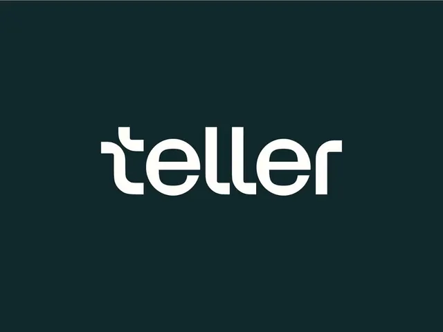
A lowercase 'teller' wordmark drawn from rounded modular strokes, set cream on a deep teal field, with a custom rounded-stem t that doubles as a checkmark-like cap.
Summary
A custom lowercase "teller" logotype centered on a dark teal ground, built from a single rounded stroke weight where the t, double-l, and r share matched curved terminals for a soft, engineered look.
Visual description
The mark sits dead center on a flat deep blue-green field, rendered in warm off-white cream rather than pure white. All six letters are lowercase and share one even monoline weight with fully rounded terminals. The standout detail is the t: its ascender is cut and stepped at the top into a small flag, almost reading as a checkmark or a stylized t-crossbar, distinguishing the otherwise geometric face. The two l's run as clean tall verticals and the e and r tuck tightly, giving the word a compact, balanced rhythm. No tagline, icon, or container, just the wordmark on color.
Key takeaway
A single custom letterform detail (the stepped t) carrying the whole personality of an otherwise neutral geometric wordmark, so the mark stays simple but ownable. Choosing cream over white against dark teal to warm a fintech palette and avoid harsh contrast.
Reuse notes
A solid reference for a fintech, payments, or B2B SaaS wordmark that needs to read trustworthy and modern without an icon. The dark-teal-on-cream pairing works well for app splash screens and dark UIs. Lean on one distinctive glyph rather than restyling every letter when you want a clean but memorable logotype.
More like this






Keep what you find
A free account saves references to boards and can send you a weekly email of picks based on what you save.
To see every result, go Pro.