Preview image. Unlock full-res
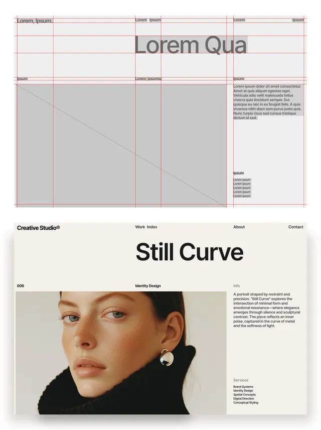
Two-part layout study showing a red modular grid skeleton above a finished Creative Studio editorial spread headlined Still Curve over a close-up beauty portrait.
Summary
A paired layout study: the top half exposes the red column-and-baseline grid with placeholder greeking, the bottom half shows the same grammar built out as a finished studio case-study page.
Visual description
The upper frame is a wireframe in light gray with bright red verticals, horizontals, and a diagonal drawn across the columns, "Lorem ipsum" greeking dropped into headline, body, and caption slots to show type roles. The lower frame is the live result: a thin top nav reads "Creative Studio" with Work, Index, About, Contact, then an oversized "Still Curve" display headline. Below, a labeled column ("006", "Identity Design", "Info") sits beside a tightly cropped beauty portrait of a woman in a black turtleneck wearing a single silver earring, the right column carrying a justified info paragraph and a "Services" list. Everything sits on a warm off-white.
Key takeaway
Show the scaffold and the build in one image: the visible red grid up top earns trust that the finished layout below is engineered, not eyeballed. The trick is reusing the exact same column structure for both. Also note the discipline of one giant headline plus one quiet metadata column flanking a single strong image.
Reuse notes
Strong reference for design-studio portfolio pages, identity case studies, and editorial templates. The before-and-after format also works well as a process slide in a pitch deck. Needs a genuinely good portrait or hero image to carry the lower half; the layout is deliberately spare.
More like this






Keep what you find
A free account saves references to boards and can send you a weekly email of picks based on what you save.
To see every result, go Pro.